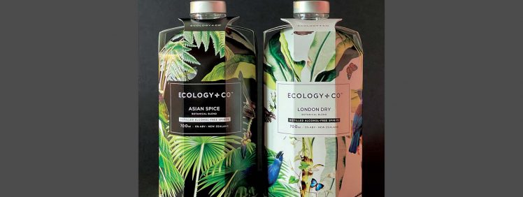
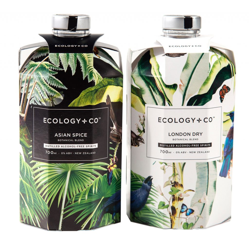
In this case study, we take a look at the unique packaging solution for kiwi zero-alcohol spirit brand, Ecology & Co.
Ecology & Co are a New Zealand based artisan producer of alcohol free spirits. Both products in the range use blended botanicals to create alternatives to alcohol-based Spirits, such as Gin or Vodka. They also distil there products without the use of artificial flavours or refined sugar. So now you can enjoy a zero-alcohol ‘G&T’ at Friday drinks!
Unique Packaging
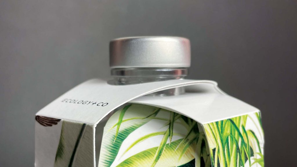
Marketing such a unique product requires careful consideration. Particularly when it comes to the packaging. Ecology & Co engaged Mike Herrick from Formation Design (Auckland) to develop the solution. As Mike explains, the client wanted beauty and functionality. Mike created the design using existing brand assets while emphasising the Ecology & Co logotype to build customer connection. Creating on-shelf impact was critical for a product with such a unique selling point. This led to a non-conventional solution for a product with a ‘difference’. —A bespoke card sleeve that enhances the story. As Mike explains, ‘We created a unique packaging shape to create an attractive point of difference and to increase the perception of product value.’
Form & Function
Like all good packaging, equally important as the form is the function. Not only does the packaging need to protect the product but it also needs to work for transportation. —Fitting snugly into the existing six-bottle shippers, reducing rattling and any subsequent breakage. For reasons of practicality, Mike designed the packaging without the requirement for any glue or double sided tape. He achieved this by incorporating easy to use, strong lock tabs into the design.
Packaging Board
Centurion Press printed the project. Working in conjunction with Mike, the team chose BJ Ball Crescendo 1 sided board. Being a premium, ultra-white board, Crescendo is perfect for high-end packaging work. Mike describes, ‘Crescendo as a favourite, as it provides excellent print holding over creases and across die-cut edges, with minimal edge-splitting for lock tabs. It has excellent printability and gives a lovely smooth finish.’
Sustainability
Although the client had no specific instructions for using a sustainable packaging board, Crescendo is produced using ECF and PEFC certified pulp. This was an added bonus. As Mike explains, ‘I like the balance between being suitable from a technical perspective and being environmentally responsible.’
Centurion closely monitored the job through the final die-cutting process to ensure cracking did not occur. This would have required the addition of an all-over matte laminate. However, as Mike explains, ‘In the end, thanks to the excellent print work from Centurion and the quality of the Crescendo stock, there were no issues. An excellent outcome, as the absence of the laminate means the packaging is fully kerbside recyclable.’
Centurion Press printed the job on their Komori H-UV Lithrone G40 CMYK offset press. The UV offers fast drying thus reducing scuffing. Simon Larsen, production manager at Centurion Press, commented on how they were ‘…pleased with how Crescendo printed, especially over and around creases, in both grain directions.’
Award Winner
Finally, a word from Mike, ‘Ecology & Co were very happy with the finished job. It’s been a joy to see on the shelf.’ The industry has also recognised this unique packaging solution. It won a Gold at the 2021 Pride in Print Awards for Structural Design Packaging in the Food & Beverage category. Well done team!
This article was originally published in GSM17. To read this and other great articles purchase this issue here.