Disparity in pay between men & women within the design industry equates to a staggering 15.5%! Two kiwi creatives decided that if numbers weren’t enough to initiate change, then maybe a more graphic approach would.
The ‘gender pay gap’ describes the difference in median hourly earnings between men and women. This gap currently sits at 15.5% for the design industry. These confronting stats, along with their involvement in the exhibition ‘Present Tense: Wahine Toi Aotearoa’, inspired Alice Murray (associate partner at Pentagram) and Lauren Priestley (Creative Director at Redwood BBDO) to take action. They got together, over a Friday night paneer curry, and came up with the Lost Time Project.
Visual Representation
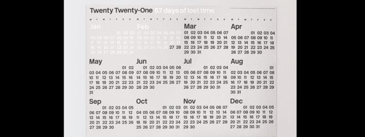
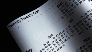 The Lost Time Project uses a wall-calendar format to convey a visual representation of what 15.5% equals in terms of an average working year. Statistically, when compared to a male, a female working full-time in the industry works all of January and February for nothing. Presenting these stats in black and white certainly confronts the viewer.
As Alice explains, ‘We both believe creativity has the power to make meaningful change. To catch someone’s eye, start a debate, change the way people think… As soon as you see the data visually represented, it comes to life, making the problem accessible to all. The gender pay gap exists, but the statistics alone sometimes aren’t enough to resonate with everyone. So we wanted to make something physical to visually demonstrate the point. We wanted to use our craft as a way to spark conversations and ignite action.’
Shifting the Focus
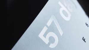 ‘Shifting the narrative to be about the time lost, instead of focusing on the monetary difference, was essential. After all, ‘time is money’. We wanted the design to land that message in a simple, provocative way. That’s why we grouped the invisible days as we did, using the transparent Spot UV gloss for the lost time. It’s a simple message, a simple fact—so the design needed to be simple, too.’
The Design
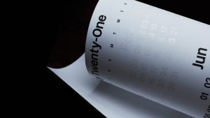 The final design is a large-scale 680mm x 980mm print that employs the typeface New Rail Alphabet designed by A2 type in collaboration with Margaret Calvert. New Rail Alphabet is a revival of the British Rail alphabet, designed by Margaret Calvert of Kinneir Calvert Associates in the early 60s.
Profits from the sale of the Lost Time Project go to organisations that empower female creatives—such as NZ Designers Speak (Up), Ladies, Wine & Design and Creative Equals.
And, to ensure we bring the issue to the attention of those with the power to make change, we have introduced a CEO initiative. Buy two prints, and we will send one directly to your CEO, accompanied by an anonymous note. A kind if not too subtle, yet metaphoric, ‘tap on the shoulder’—may be it’s time we change.
To learn more about the Lost Time Project or to purchase prints—go to: //losttimeproject.com
This article first appeared on DesignAssembly.org.nz and is published in partnership with our friends at DA.