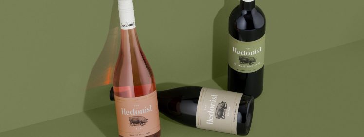
In pursuit of modernising and strengthening their long-standing brand, The Hedonist team approached Byerlee Design, a creative studio specialising in alcohol & beverage brands. GSM takes a look…
The Hedonist Vineyard
The Hedonist vineyard, located in the Willunga foothills of McLaren Vale, Australia, is run by Walter Clappis, veteran winemaker of 36 years, along with daughter Kimberly and her partner James Cooter. They are passionate about making their wines using certified biodynamic and organic vineyards and winemaking practices.
Byerlee Design was engaged to reinvigorate, rather than rebuild, The Hedonist brand. As James explains, ‘We had been following Byerlee’s work on Instagram for a while, we were a fan of the level of detail involved in his designs. There are often many layers to his work. The paper texture, patterns, embossing and high build all add to the tactile nature of his labels’.
The Rebrand
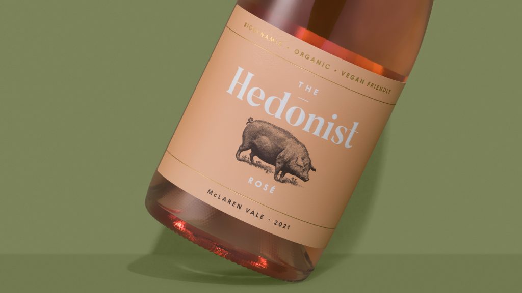 Key to the re-brand was the client’s desire to retain certain elements. This was to remain recognisable within their export market—a large percentage of The Hedonist heads to the United Kingdom. Thus, the UK’s audience became a big focus point with a strong consideration for their market trends. They also wanted to attract a younger demographic. And so, The Hedonist needed to remain recognisable, yet have more life, substance, and shelf presence. As James explains, ‘We didn’t want to take ourselves too seriously, but at the same time it was important for us to convey more about ourselves and our philosophies into the packaging. This included being family owned and operated, certified organic and biodynamic, and committed to sustainable practices. Treading lightly on the earth’.
‘We began by meeting with David Byerlee to discuss our wish list, including key elements we wished to retain and where we needed to revitalise. David offered additional advice from a branding perspective, initially offering two different versions of the new label—a more conservative option and a bolder one. We went with the bolder option’.
To Keep or not to Keep
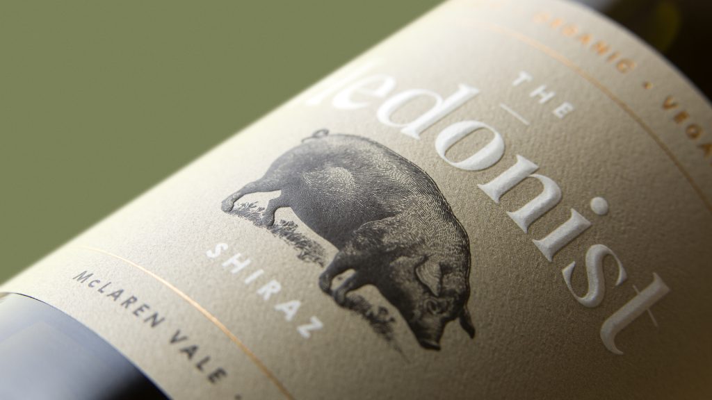 The retention of the brand’s existing and adored pig icon was non-negotiable. Thus, Byerlee retained the pig’s size and stance on the label for recognisability. But reproduced it in a more lively and detailed illustration.
A big focus in the creative process are the winery’s environmentally friendly practices. These are swiftly communicated on the packaging via a new tone-of-voice and visual cues. Key messages, brand story, tactile finishes and an earthy colour palette all play a role in representing the product authentically.
‘A softened and considered approach was born to set a new standard moving forward. The refresh saw The Hedonist transition into the modern wine market with a confident voice and stronger shelf-presence, whilst retaining their brand recognisability and a loyal customer base from across the globe’, explains David
When asked how the project evolved from the original brief, David believes the brand evolved into a very tactile, approachable, and thoughtful product.
‘A real representation of the wine in bottle, and the kind people behind the brand’.
Printing The Hedonist Label
When it came to selecting a printer, Signature Labels, Adelaide, were the obvious choice as The Hedonist have had a long-standing relationship with them.
‘Signature were very eager to get the best result for us, so we were in good hands. We all attended the press pass—it was a group effort with everyone being 100% happy with the outcome’. Robert Malliotis, Signature Labels Managing Director, explains ‘It was decided the best print process would be offset printing to ensure an exact colour match. We printed the labels on our Miyakoshi offset press with the critical part of the production being exact colour matching with crisp sharp printing. And we produced the embellishments on a Cartes embellishment machine. Embellishments included screen, matt varnish and a male-female brass tooling to ensure maximum sculptured embossing depth and sharpness of the image. Hot stamp foiling then followed’.
Label Stock
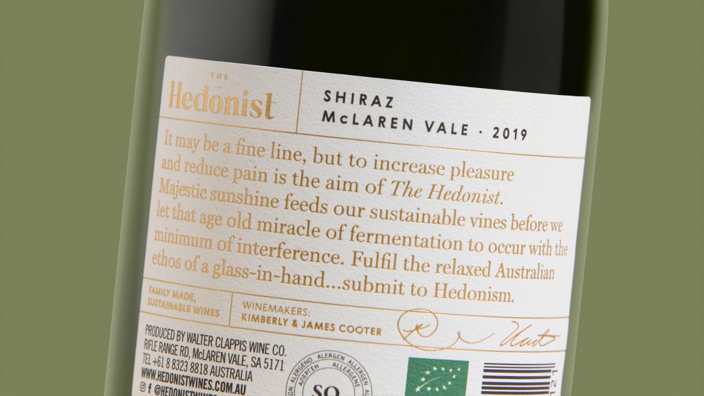 Choice of label stock was Ball & Doggett’s Wausau Bright White Felt (also stocked in NZ by BJ Ball), which Byerlee selected for its natural and textured finish to reflect the brand’s environmental practices. An additional bonus to selecting this grade is its 30% post-consumer waste content. Performance and cost-effectiveness also played a role. As David mentions, ‘Bright White Felt provides a premium finish at a much cheaper cost when compared to similar stocks on the market. The label’s performance has been brilliant. The embosses have retained the strength over time and the adhesion is great. With the brand’s product portfolio continually expanding, all labels will remain on Bright White Felt.
A Few Tweaks
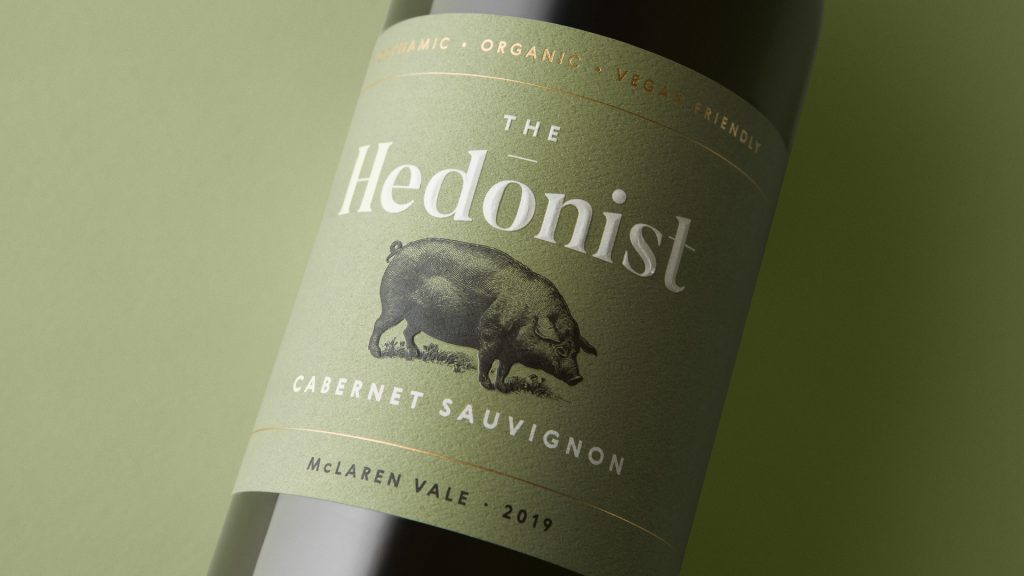 During the concept refinement process Byerlee made a few tweaks along the way, from separating the logo and illustration to tweaking the label colours. As David explains, ‘Originally the large logo was proposed sitting lower on the label and slightly behind the illustration, so the pig appears in the foreground. However, we later separated the two elements to create better legibility and breathing room. Separating this overlay benefited the chisel emboss strength and impression’. James adds,
‘we kept the integrity of the design, which captured us all from the onset’.
Robert is considerably proud of the result, saying ‘Our staffs’ efforts in printing and quality assurance were outstanding’. The Hedonist team love their revamped labels. As James says,
‘We only wish we’d done it sooner. The key messages we wanted to convey are much clearer and portray a sophisticated, yet grounded feel’.
Robert adds, ‘the final label print exceeded all of our expectations. An eye-catching label range that has enhanced good shelf appeal ensuring both Hedonist Wines and the Hedonist ranges continued success.
Signature Labels are proud to be a part of the Hedonist experience’.
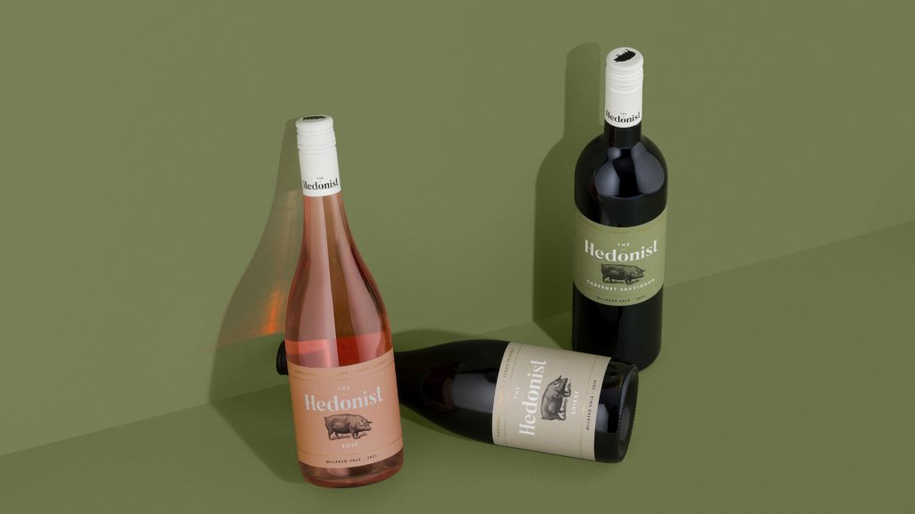
GSM would like to thank David Byerlee @Byerlee Design (SA), James Cooter @The Hedonist Vineyard (SA), and Robert Malliotis @Signature Labels (SA) for their contribution to GSM magazine.
For more information on Wausau Bright White Felt stock—go to:
Australian readers: //ballanddoggett.com.au
NZ readers: //bjball.co.nz
This article was originally published in GSM21. To read this and other great articles purchase this issue here.

