The digital design work of American Susan Kare marks a significant milestone in the history of modern design. GSM takes a look at her career…
If you were about in the 1980s, you probably remember the first Apple Macintosh. It was a truly ground-breaking product that went on to become a global phenomenon. The success of the first Apple Mac was thanks to the adoption of the Graphical User Interface (GUI). The GUI hid the lines of system code to ‘de-geek’ the technology for the average home user. Today, we take GUI for granted, but in the 1980s—Mac OS System 1 was revolutionary. This shift required the design of a completely new visual-based language. One that was limited by the significant technical constraints of the time and on which there was no precedent. One of the pioneering creative minds who led the charge in this new digital medium was Susan Kare.
From Fine Art to Digital Design
Susan Kare’s interest in graphic design began when she scored a student job at The Franklin Institute Science Museum in Philadelphia. She was assistant to exhibition designer Harry Loucks. Susan then went on to study at the Mount Holyoke College. She later earned a Ph.D. in art at New York University. Following graduation, Susan relocated to work at the Fine Arts Museums of San Francisco (FAMSF).
Everything changed when an old high school friend, Andy Hertzfeld, mentioned he was working as a software developer for Apple. Andy was working on a new type of computer called the Macintosh. They recruited Susan to help develop the interface graphics and fonts for what was to become ‘Mac OS System 1’. She later worked as a Creative Director in Apple Creative Services.
Following Apple, Kare joined NeXT (the company formed by Steve Jobs after his exit from Apple) as Creative Director. In the early 90s, Susan founded her own design practice in San Francisco. It was here that she developed digital work for many clients including Microsoft, IBM, Autodesk, and Facebook. Since 2015, Susan has worked as CD for Pinterest. She also sells prints of her designs through her online shop. Susan has received a number of significant awards in recognition of her design work including;
- the American Institute of Graphic Arts medal in 2018,
- National Design Award from the Smithsonian in 2019, and
- the Lifetime Achievement Award from the Cooper Hewitt Smithsonian Design Museum.
Digital Design for Apple:
Susan’s groundbreaking work at Apple included designing many of the original icons, interfaces, and illustrations for the first Macintosh. Some of these icons are still recognisable in their modern day interpretations. For example, the lasso, trash can, grabber and paint bucket. To fit the technical constraints of the early monitors, much of this early work is monochromatic.

Happy Mac was designed by Susan as the startup icon used in classic Mac OS. The concept came from the shape and form of the original Mac. There was also an alter ego—Sad Mac, which would appear on-screen when things went awry. Happy Mac underwent several revisions for various versions of Mac OS. More recently, the Face ID logo used in the latest version of iOS and running on the iPhone X.
Is it a dog? Is it a cow…? Clarus the Dogcow was originally designed by Susan as a glyph for Cairo font. The icon was later commandeered by Mac OS for use in displaying page orientation in various print dialogue menus. It was then side-swiped as the official mascot for Apple’s Developer Technical Support team. The term ‘Dogcow’ was coined by Scott Zimmerman. The name Clarus came later by way of Mark Harlan. Clarus was the name used by Apple’s business unit for office software at the time. Apparently, Clarus can sometimes be heard making her own unique ‘Moof!’…
Fine Art influencing Digital Design:
Many of Susan’s early icons originate from her studies in art history and hieroglyphics. Take, for example, the Command icon, designed for the original Macintosh menus as a keyboard shortcut symbol. The Command icon is based on the Saint Hannes Cross. Nordic countries have used the cross since the 1950s to denote ‘places of interest’.
![]()

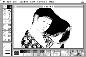
Susan also produced a number of illustrations and interface designs for early Apple software. An example of this is MacPaint, a pre-Photoshop, rastor based drawing program, launched in 1984. Susan based it on a Japanese woodcut belonging to Steve Jobs. 
Bitmap Font Design:
Due to the limited capability of the technology, early OS systems included families of bitmap fonts (also called raster fonts). These fonts were designed pixel by pixel to be used onscreen at specific sizes only. Every weight of each font required the creation of a new set of characters. Often these were drawn at 8, 9, 10, 12, 14, 18, 24, 36, 48 and 72 points. If you used these fonts at a point size other than their native drawn sizes they would ‘pixelate’ or break-up. Thankfully, as technology improved, vector based ‘outline’ fonts replaced bitmap fonts. These used anti-aliasing to render smoothly on-screen. It allowed fluid scalability and better printability.
Susan Kare worked on designs for a number of early bitmap fonts including Monaco, New York, Geneva and Chicago. Newer versions of these fonts are still in use today following numerous reiterations over the last 30 years.

Susan developed the original San Francisco font to mimic a ‘ransom-note’ effect for Apple. Many describe it as a kind of font mishmash. Apple used the font in early software demos and promotional material. However, they shelved it prior to the release of System 7 in 1991. An official outline version was never created.
She also designed ‘Cairo’. An early dingbat font made famous for dogcow. It also included many characters that are still recognisable as user-icons from their modern descendants.
Design Work for Microsoft

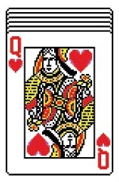
Susan also worked for the other team, Microsoft. She designed the card deck used in the infamous Solitaire game, shipped as part of Windows 3.0. She also designed a number of icons for Windows. Many of these remained almost unchanged until version XP was launched in 2001.
And back to Fine Art
In 2004, The Museum of Modern Art (MoMA) store in New York, collaborated with Susan to develop a number of stationery products such as magnets, gift tags, and notebooks featuring some of her most recognisable icon designs. In 2015 MoMA also acquired her sketches that led to the early Mac icons. MoMA describes Susan as, ‘a pioneering and influential computer iconographer’. Susan also produces and sells prints of her best loved icon work.
Design Beyond Pixels…
We often associate Susan Kare with pixel art and the emergence of digital media. However, it is by no means her only expression in graphic design. Susan Kare’s portfolio is truly impressive!

GSM would like to extend our thanks to Susan Kare for allowing us to showcase her work in GSM Re-Edit, and to Cathy Cook for her time in collating and supplying the material.
This article was originally published in GSM Re-Edit. To read this and other great articles purchase this issue here.


