Storm Thorgerson was a British graphic designer responsible for some of the most evocative album covers ever made. Pink Floyd’s The Dark Side of the Moon (1973) and Led Zeppelin’s Houses of the Holy (1973) are prime examples.
Having attended high school with Pink Floyd founders Syd Barrett and Roger Waters, it was almost predestined that Thorgerson be a part of the music industry in some way or another. But it didn’t start of that way. GSM takes a look at Storm Thorgeson’s career and his work…
His Career
Thorgerson attended the University of Leicester, from where he earned a Bachelor of Arts with Honours, majoring in philosophy and English. He later attended the Royal College of Art where he received his MA in television and film production.
Thorgerson began his professional career in 1967 when he founded the graphic art group Hipgnosis. He and his partner, Aubrey Powell, focussed on designing music record covers. Following the dissolution of Hipgnosis in 1983, Thorgerson and Powell founded Greenback Films, in order to film music videos. After that, Thorgerson founded Storm Studios in the early 1990’s. He joined forces with fellow graphic designer Peter Curzon. Soon after, Rupert Truman and Dan Abbott joined them, along with a changing team of freelancers. Storm Studios have created designs for many diverse projects including exhibitions, company logos, websites, typefaces, books and airships. But most notable are the design of album covers. Think bands such as Pink Floyd, Muse, Biffy Clyro, The Steve Miller Band, Ian Dury And The Blockheads, Pendulum, The Cranberries, The Mars Volta, Alan Parsons and many others.
His Design
The designers of album covers don’t usually get much attention. However, Storm Thorgerson was different! He really made his name creating fantastical and arresting photographic tableaux.
A major influence in his generation of photography and collage were the surrealist paintings of René Magritte. 

Most of Thorgerson’s designs included surreal elements which lent a unique quality to his work. According to Thorgerson, photography has an element of reality to it, unlike drawing. Thus, his works project a twist in reality and ask its viewers whether it is real or not.
His craft often presented objects outside their original context. Placed in a wide space which appeared odd on the surface but held beauty to the design, on the whole. The manipulation of his classic landscape shot was made that more impressive because Thorgerson worked in an age when Photoshop did not exist!
GSM16 pays tribute to the man whose art was every bit as loud as the music it wrapped. Here are just a few examples…
His Work
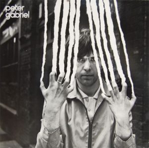
 Peter Gabriel – Peter Gabriel (1978)
The cover for Peter Gabriel’s self titled second solo album is an example of collage and photography working together to create an image where it appears as if Peter is destroying the photo as it is being taken!

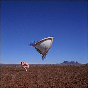
The Cranberries – Bury the Hatchet (1999)
Storm was both “surprised and heartened that the Cranberries chose the design at all… the Cranberries had previously used pictures of themselves, often on a sofa. Our image was clearly a departure, not a sofa in sight. The second miracle arose after we decided that red earth was paramount to contrast with a blue sky, which had to be empty (ie cloudless, to echo the empty landscape and to emphasise that the All Seeing Eye can get you anywhere).”

Phish – Slip Stitch and Pass (1997)
The most impressive thing, for Storm, about the band Phish was going to see them live and discovering that they did not have a set list. No set list? Horrors! The second impressive thing about Phish was the degree of improvisation in their concerts. Improvisation was what Storm was trying to represent in this design.

Pink Floyd – Dark Side of The Moon (1973)
Dark Side of the Moon cover was a different matter. As Storm said it was never about the music but rather how he reinterpreted it. “It doesn’t really matter what I think, it matters what comes out the other end. And with Dark Side it was very much about the madness of the lyrics and about something that Rick said to me. He said “Could we not have one of your funny pictures, Storm?” and I said “What do you mean? That’s what I do. Pictures. How about a change?” I said “But I don’t do graphics.” He said “Well, why is it a challenge?””
The idea of the prism related to the triangle, how it is a symbol of thought and ambition. as well as being a subject of Roger Waters’ lyrics. Add this to Pink Floyd’s light show and the prism was born.
Storm sadly passed away in 2013.


