
Award winning designer, Stefan Sagmeister, is one of the most imaginative and original creative thinkers around today.
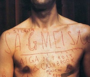
Known particularly for his type and handwriting-inspired designs, Sagmeister has created some of the boldest, most innovative, engaging work around. None more so than his use of the human body as a canvas. He makes type come alive, literally!
His Background
Sagmeister was born in Austria but now lives and works in New York. He began his career path studying graphic design at the University of Applied Arts, Vienna. From there, he received a scholarship to study at the Pratt Institute in New York.
In the early nineties, Stefan spread his wings to work at the Hong Kong office of global advertising giant, Leo Burnett. He then returned to New York to briefly work with Tibor Kalman’s M&Co design company, before co-founding his own practice with Jessica Walsh – Sagmeister & Walsh Inc, NYC.
His Career
Sagmeister & Walsh Inc creates identities, commercials, websites, apps, films, books and objects for clients, audiences and themselves.
 However, Sagmeister is also known for his work in the music industry. He has worked for the Rolling Stones, The Talking Heads, Lou Reed, Jay Z, Aerosmith, and Pat Metheny. Not to mention, his diverse client list which includes The Guggenheim Museum, HBO, and Levis.
Sagmeister has done four TED talks and written several books, including the design monograph ‘Made You Look’, published by Booth-Clibborn editions. He is also a dedicated educator, teaching in the graduate department of the School of Visual Arts in New York. The Cooper Union School of Art, New York has also appointed him as The Frank Stanton Chair.
Sagmeister’s work has been exhibited in numerous design hotspots worldwide. They include Zurich, Viennna, New York, Berlin, Japan, Prague, Cologne and Seoul to name but a few.
His Work
In order to understand the extent that Sagmeister pours his heart and soul into his work, attending to every single detail, let’s take a look at some examples:
Frooti

Frooti is one of India’s oldest and most loved mango juice brands. The goal was to introduce the new packaging in a fresh, bold and playful way. The idea was to create a miniature world using tiny scaled models of vehicles, people and plant life. Only the Frooti packaging and mangoes were kept in real life scale. This allowed the packaging and the mang o to appear as the hero of the shots while allowing us to tell stories and add moments of humour. To add a sense of playfulness across the imagery we introduced four bold colours to the brand. All of which were chosen to compliment the yellow of Indian mango.
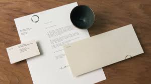
The Jewish Museum
The Jewish Museum is located in a beautiful seven story mansion in the Upper East side of Manhattan. Devoted to art and culture, the museum’s reach expands to a diverse audience through extensive interdisciplinary programming and contemporary exhibitions.
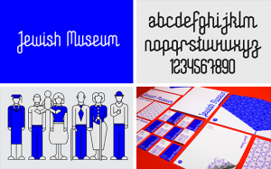 Stefan re-branded the museum with the aim of connecting the historic and the contemporary, as well as to engage multiple visitor generations. He founded the new identity on ‘sacred geometry’, an ancient geometric system from which the Star of David descended. Stefan went one step further by drawing the entire branding system on this grid. From the word and logo mark, to dozens of patterns, icons, typography and illustrations.
The Aldrich Contemporary Art Museum
 The function of this institute is to advance creative thinking by connecting today’s artists with individuals and communities in unexpected and stimulating ways. The architecture of the museum inspired the strong progressive upwards arrow in the logotype graphic.
Otium
Otium is a contemporary LA restaurant that draws on the rich culinary heritage of chef Timothy Hollingsworth. You can find it adjacent to one of Los Angeles’ most important culinary corridors, Grand Avenue. It’s other neighbour is The Broad Museum of Contemporary Art. Hence, the restaurant was designed with these communal spaces in mind.
The name, Otium, comes from Latin. A word that describes a place where leisurely social activities take place. In line with this, the restaurant features an open kitchen to merge both indoor and outdoor areas. This creates a casual atmosphere in which people can socialise and relax.
 Inspired by this concept, Stefan’s team created a brand that brings the outdoors in. They have achieved this with the use of printed textures that evoke natural elements. Think concrete, sand, marble, wood and vegetation. The combination of the different tactile elements gives the identity a level of sophistication, as well as a hand-crafted appeal.
They also created a large mural to compliment the restaurant’s interior design. With custom lettering composed of shrubs and plants, it serves as another way to bring the outside indoors.