
In this Education article, we take a look at some basic considerations for setting up print artwork…
Some Artwork Basics
A common cause of hold-ups in print work is artwork files set up incorrectly. This article covers some basics around setting up artwork to avoid the most common mistakes.
For this article, we will assume Adobe Illustrator, InDesign (or QuarkXPress), and Photoshop are used to construct the artwork. And that the dispatch file to the printer is a high-resolution PDF (the industry norm for print artwork). We strongly advise against using office-level apps (such as Microsoft Word or Apple Pages) or web services, such as Canva, for generating artwork for commercial-level print.
The checklist below is applicable for both offset lithography and digital print processes.
Correct Page Size:
In InDesign or Illustrator, set your page size to the intended finished trim size. Note that if your project is a multi-page document, the trim size is the bound folded size.
As a general rule, and unless the printer instructs otherwise, do not set your artwork up on an oversized page or attempt to gang or impose the artwork. The prepress team at the printery will sort these things for you.
 Our sample project has been set up as a single A5 artboard (in Illustrator) with 5mm bleed on all edges.
Adding Bleed to your Artwork:
Any project with design elements and content running to the trim edge must include bleed. These elements must extend to the edge of the bleed area.
The purpose of bleed is to compensate for any inaccuracy in the trimming, a manual process done using a guillotine. Without bleed, the final piece will likely have unsightly white hairlines around any edge where the trimming was slightly off.
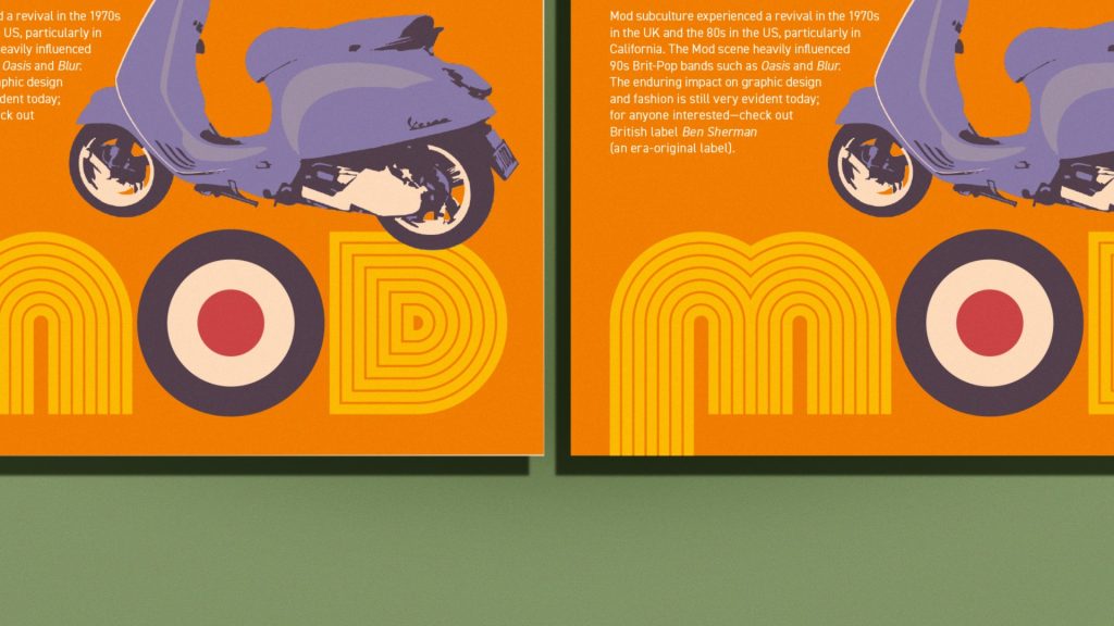 Look at the image of our sample artwork, this close up shows two versions: the left was printed without bleed, and the right version with bleed. On the left version, you can see the white paper showing around the edges where the trimming has slightly missed.
Adding a 3–5mm bleed on all trimmed edges is sufficient (note that multi-page documents do not need bleed on the inside binding edge/gutter).
To add bleed, use the Document Setup function—go to:
File > Document Setup > under Bleed:
Enter an amount into the fields; this will add a bleed guide to your artwork. You must then extend the necessary elements to (or past) this bleed guide. It is ‘best practice’ to set bleed on a document at the start of the project—not at the end (it will definitely make life easier).
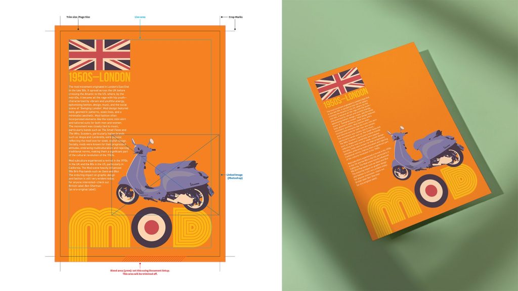 Diagram of our sample artwork showing this with the bleed added. Note how the orange colour fill and the M graphic extends to the bleed guide.
Be mindful of the Live Area:
A live area is a ‘safe zone’ within your page. The purpose is to avoid something important being trimmed off (like a phone number or website address) because it sits too close to the trim edge. There is no hard and fast amount for setting a live area, and there is no ‘live area’ function within the design apps. Instead, just be mindful that anything important falls inside a safe zone. Just don’t put anything important near the trim edge!
Correct Image Resolution:
All photographic images reproduced using a commercial print method must be high resolution. Check the resolution of your images using the Links palette—go to:
Window > Links
Select an image and then click the small arrow in the bottom left of the Links palette (this displays information about the image file).
Just note that this information is displayed differently between InDesign and Illustrator. In the Illustrator Links palette—you are looking at PPI.
In the InDesign Links Palette, you are looking at the Effective PPI (ignore Actual PPI). The number here needs to be at least 300ppi; anything less than this (for example, 72ppi or 150ppi) and you run the possibility that this image will print fuzzy or pixelate (print as a matrix of squares).
Note that if you are working in InDesign and have linked Illustrator files in your artwork, these Illustrator files will not display a PPI resolution. This is because vector files are resolution-independent (you can ignore these).
Low-resolution images need to be replaced with high-resolution versions. If high-resolution versions do not exist, you must use a different image or re-shoot the photo. There is no other satisfactory workaround for this issue—do not use Photoshop to increase the resolution by ‘scaling up’ the file (Interpolation).
Use the correct Colour Space for Artwork Photos:
The other thing to check while going through the Links palette is the Colour Space of each image. All photographic images should be CMYK—not RGB. To change an image’s Colour Space, open the file in Photoshop, then go to:
Image > Mode > CMYK Color.
Then, re-save the file and update this using the Links palette.
It is important to note that when using either InDesign or Illustrator, any embedded images will not update (as these are link-independent). These will need to be placed back into your file from scratch (one reason not to use embedded images).
Use the correct Colour Mode for InDesign & Illustrator Files:
Always set your artwork files to the CMYK (Print) colour mode when working towards a print outcome—not RGB (Screen).
When you set up a New Document, use one of the print presets in the New Document window—this ensures the file is CMYK. If a file is in the wrong mode, you can swap this (but it is best to have this correct at the start).
Using InDesign, go to:
Document Setup and change the Intent to Print.
In Illustrator, change the mode by going to:
File > Document Color Mode.
Just be aware that swapping the colour mode of a file will potentially cause problems with colour swatches inside the artwork (next point).
Use CMYK—not RGB colours in your artwork:
A whole topic on its own, is the issue of RGB colours in CMYK print artwork. Usually caused by copying and pasting, or placing graphics, from a file set up in RGB Color Mode into a file set up in CMYK Color Mode, or by switching the Color Mode in a file. At the core of the problem is the fact that many RGB colours fall outside the printable CMYK colour spectrum.
Printing any RGB colour using a CMYK process (which includes offset lithography and digital processes) requires reinterpretation of the RGB colour (this is done by the print RIP software). The results can often be a long way from the intended result.
A healthier practice is finding, editing, changing to CMYK, or removing any RGB colours in your file. But better still, don’t use RGB colours in print artwork in the first instance, as they do not belong there.
Crop & Printers Marks:
There was a time (…not so long ago…) when crop marks had to be added manually to artwork. However, the adoption of high-resolution PDFs as the preferred format for supplying artwork for print has done away with this requirement.
So, unless instructed otherwise by the printer, you do not need to manually add Crop Marks (or any other printer marks) to your source file artwork.
Instead, add these when exporting the artwork PDF by selecting Crop Marks, along with including the Document Bleed, under Marks and Bleed in the PDF export options.
Conclusion
That concludes this instalment of Education; we hope this contributes to a better understanding of setting up artwork for print. Keep an eye late 2024 for our GSM print special covering this (and much more) in detail.
GSM would like to acknowledge David Whitbread, author of ‘The Design Manual,’ for assisting with collating material for this article. For more information on The Design Manual—go to: //thedesignmanual.com