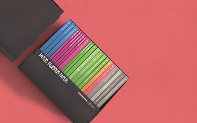
Paper is an integral part of the print job. How it looks and feels is going to have a big impact on the end result. Considering the paper stock at the very start of the job (i.e. the concept stage) means the final printed piece will tick all the boxes.
So, what are some of the things we should consider when selecting paper for a print job? Start with the bigger picture:
- What message are you conveying – How does it look and feel?
- What is the printed piece being used for and in what situation?
- How long does it need to last in the marketplace?
- How are you printing it – offset or digital print?
- What paper fits within your budget?
Now, think about the finer details of choosing your paper. Here’s a checklist to help you:
UNCOATED VS COATED
- Coated paper has a clay coating to add smoothness and either a Matt, Satin or Gloss finish. The clay coating acts as a barrier to stop the ink being absorbed into the paper, thus giving the image definition and making colours appear brighter – perfect for a company profile or real estate brochure.
- Uncoated papers have no coating, they have a raw, organic feel and can be textured. However, uncoated paper can be susceptible to dot gain, when the ink is absorbed into the paper and spreads. This isn’t a bad thing, it just means the image appears softer, both in definition and colour – think furniture catalogue or brochure for a company with an environmental message.
SMOOTH VS TEXTURE
- Smooth paper enables light to be reflected more evenly thus producing brighter colours and crisper images – for example, a fashion catalogue.
- Texture adds more interest and enhances your message on a subliminal level – perfect for scenic images but not ideal for skintones – use for clothing swing tags or for the cover of a company profile.
WHITENESS
The whiteness of a paper conveys a look, as well as affecting the colours of your image:
- A crisp bright white conveys professionalism and brightness of colour.
- An off white/cream suggests a softer feel with a more muted/sepia look possibly conveying an environmental approach.
WEIGHT/THICKNESS
Paper is measured by weight – grammes per square metre (gsm) and board is measured by thickness – microns (Um). There are a number of reasons to consider weight/thickness:
- Show through – In general, the heavier the paper weight the higher the opacity of the paper. This means less show through which is important when there is a lot of ink coverage.
- Bulk – for a job with just a few pages, bulk up the look of the booklet by selecting a heavier weight e.g. 130gsm instead of 115gsm. For a multi-page booklet, which requires posting, drop the page weight to keep postage cost low.
- When selecting your cover weight think outside the square, consider packaging boards that add more bulk over fine papers and can keep you within budget.
- For packaging, always talk microns both for folding considerations and to hold the contents of the packaging.
PAPER SUSTAINABILITY
Paper sourced from sustainable pulp with minimal impact on the environment is essential to creating a Circular Economy. Ensure your chosen paper carries environmental credentials from either the forest level:
- FSC – Forest Steward Ship Council
- PEFC – Programme for the Endorsement of Forest Certification
- Well Managed Forests
- Farmed Trees
Or the mill level:
Check out our blog on Environmental Credentials and Certifications for more information.
SAMPLES
Finally, with paper selected, organise for a mock-up to be made to enable the client to truly visualise what their job will look and feel like. A mock up also helps you to see actual thicknesses, sizes and weights. This is important for bindery details i.e. weight of cover & style of binding, as well as postage and direct mail costs.
You can order your mock up from BJ Ball Designline.


