
Her work is characterised by bold blocks of colour combined with a strong sense of form. Australian Lynda Warner has not only built a career championing graphic design in her adoptive home of Tasmania – but has done so at a time where the industry was heavily male dominant. GSM takes a look…
How it all started
Lynda Warner recognised graphic design was her calling at a young age—when, in the sixth grade, a poster project introduced her to the world of commercial art. She was hooked. Following advice from a family friend (who was themselves a commercial artist), Lynda enrolled at Sandringham Technical School and, shortly after, transferred over to Swinburne Technical College—considered to be the most advanced design school in Australia at the time. At Swinburne, Lynda studied various fine arts and design subjects, including printmaking, photography, art history, and typography.The College’s renowned film school also proved a source of significant inspiration.
Influencers of Lynda Warner
At Swinburne, Lynda came under the tutorage of art history lecturer Maurice Cantlon, which had a considerable effect. As Lynda explains, ‘he delivered topics of architecture, film and design with such ease and enthusiasm that it has enriched my own desire to explore these areas to this very day.’ Also studying at Swinburne was Sue Allnutt—future Director at Melbourne studio Nuttsell. The pair formed a longstanding friendship as both sought to overcome similar challenges in establishing careers in what was, at the time—a male-dominated domain.
First Steps
In 1973, after four years of study, prominent designer Brian Sadgrove (AGDA Hall of Fame, 2006) hired Lynda. As Lynda readily admits, she was unprepared for the rigours of professional work, ‘I had a three-year apprenticeship with Brian, which was possibly a bit too long, but it was hard to leave working with a master. At the time, it was only Brian and me. I was his finished artist and rarely had any design input, but that wasn’t a great concern. I was there to absorb. Having that one-on-one relationship in those formative years profoundly affected me.’ Brian recalls that time fondly, ‘work [Lynda] helped produce was selected to be published in the 1975 Art Directors Club of New York.’ The two have remained friends for over four decades.
A Reductive Approach
Warner absorbed Sadgrove’s reductive design approach, a disciplined process she describes as ‘paring away the unnecessary to get to the essence of an idea.’ Sadgrove also introduced her to architecture. He shared his office with the renowned architects Cocks and Carmichael, often collaborating with the firm on projects. This early exposure sparked a lifelong interest in architecture and how graphic design can integrate into this.
Career Development
Following her time with Brian Sadgrove, Lynda pursued various short-term employment stints to build diverse experiences of different businesses. One of these was working with designer Keith Gray. This opened the door to an in-house role with architecture firm, Clarke Hopkins Clarke. The firm’s primary source of work was in education and multi-purpose sports centres; signage, marketing material, and project presentations quickly became her main focus.
In 1982, Lynda began transitioning into her own practice and eventually settled into a co-share office with architect Keith Streames. As it happened, a neighbouring business, Japanese Food Importer Spiral Foods, was looking for some help with their packaging. This began a long-term client relationship that continues to this day. In fact, some of Lynda’s designs from the 1980s are still gracing supermarket shelves.
Lynda’s business grew organically via word of mouth and through building collaborative relationships based on ideas and processes. Lynda never desired to emulate the rapid growth of many contemporary studios of the era. ‘Business does not drive me, never has. It is the process of design that I am passionate about. I deliberately chose not to ‘grow’ in a world that seems to worship this concept. That’s not to say that I don’t value growth at all, but the growth that I do value is one of ideas and the process of realising them.’
Lynda Warner Moves Away from Melbourne
In 1983, Lynda left Melbourne to follow her partner to Tasmania. As she describes, ‘When I arrived, Tasmania was a design wilderness. There were two listings under graphic designers in the business directory, and they were actually artists. Luckily, I arrived when Tasmania’s quality food, wine, and tourism industries were in their infancy. Over the years, I have enjoyed being part of the development and corresponding appreciation of graphic design in the business community.’ Also contributing to her success was the ability to maintain much of her Melbourne work. Throughout the 1990s, Lynda’s reputation gained further traction with key projects completed for Australia Post and the 2000 Sydney Olympics. In 2019, Lynda Warner was inducted into the Australian Graphic Design Association Hall of Fame. Today, Lynda continues to produce work of the highest calibre from her Hobart based studio.
Olympics Downunder
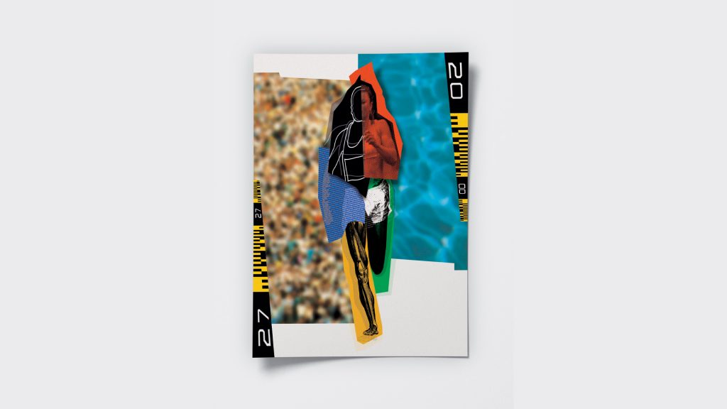 In 2000, Warner was the only woman, alongside seven male designers, commissioned to design a poster for the Sydney Olympics. Focusing on a quote from Antonio Samaranch which spoke of the way that ‘sport brings people together, irrespective of race, religion and political convictions’, Warner’s poster depicts an abstracted female athlete composed of disparate elements
Brands – Lynda Warner
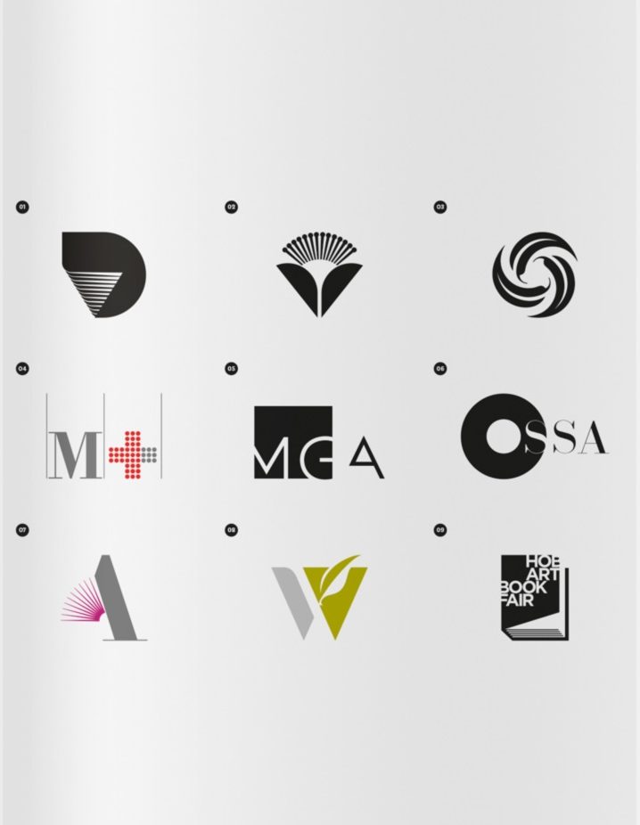 The many brands developed by Lynda Warner offer a timeless snapshot of Australian Graphic Design from the eighties to the current day:
01. Association for the Development of Design in Tasmania, 1986
02. Tasmanian Floriculture Association, 1986
03. Eltham College (Melbourne), 1992
04. Menzies Centre for Population Growth (later renamed to; Menzies Institute for Medical Research, Tasmania), 1988
05. MGA Architects (Tasmania), 2011
06. Ossa, 2000
07. Artemis Publishing (Tasmania), 2013
08. Wild Island (Tasmania), 2014
09. Hobart Art Book Fair, 2018
From Big to Small
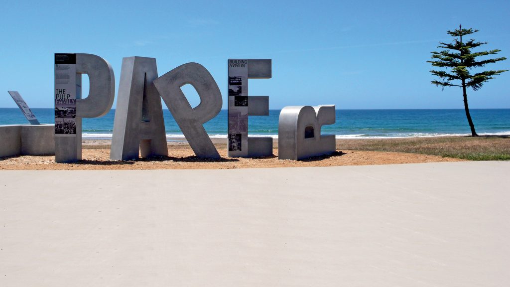 In 2013, Lynda collaborated with Tracey Diggins to create this installation for the Burnie Pulp Paper Trail which forms part of the Coastal Pathway running along the foreshore at South Burnie (north west Tasmania). The project honours the men and women who came to Tasmania to work at the historic paper mill between 1937 and 2010. Warner’s bold typographic forms provide an interpretive journey for visitors to follow. Reflecting on this compelling work, and her career more broadly, Warner neatly encapsulates a distinctive and individual methodology; ‘This is a project that probably covers all that I have learnt over the years, indulging the frustrated architect within me, a love of typography and the opportunity to collaborate with like-minded people who have enriched my vision… and all standing proud against a beautiful open space.’
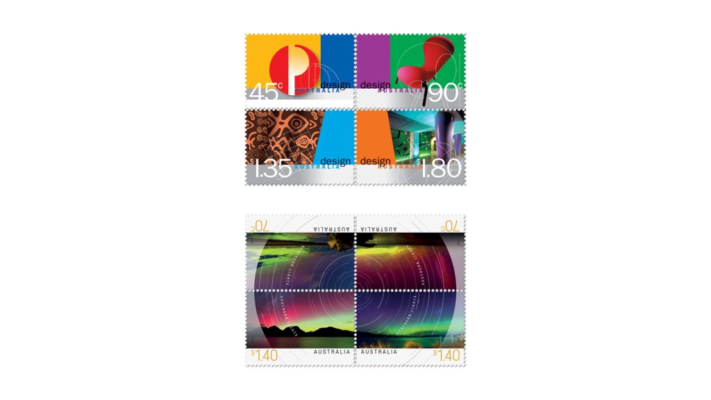 At the other end of the size-scale spectrum; Lynda has created a number of stamp designs for Australia Post— including this series from 1999 celebrating local design (above top), and the Southern Lights (above bottom), 2013.
Food Packaging – Lynda Warner
Lynda was the right person, in the right place, at the right time, picking up packaging work for Melbourne-based Japanese food importer—Spiral Foods. This pattern repeated itself for Lynda in the early eighties, when she relocated her studio to Tasmania—which, at the time, was somewhat dry on graphic design talent but bursting with local food & wine producers looking to break onto the global scene. All of which became an ongoing source of work.
01. Assorted label designs; 
> Meadowbank Vineyard, Mardi Sparkling, c. 2006
> Sugarloaf Ridge, Pinot Noir, c. 2004
> Island Berries Tasmania, Gourmet foods, c. 2016
02. Spiral Foods label designs, c. 1982 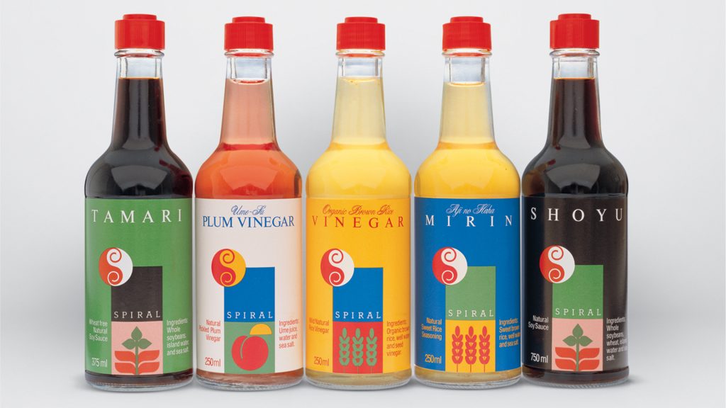
03. Spiral Foods label designs, c. 2013 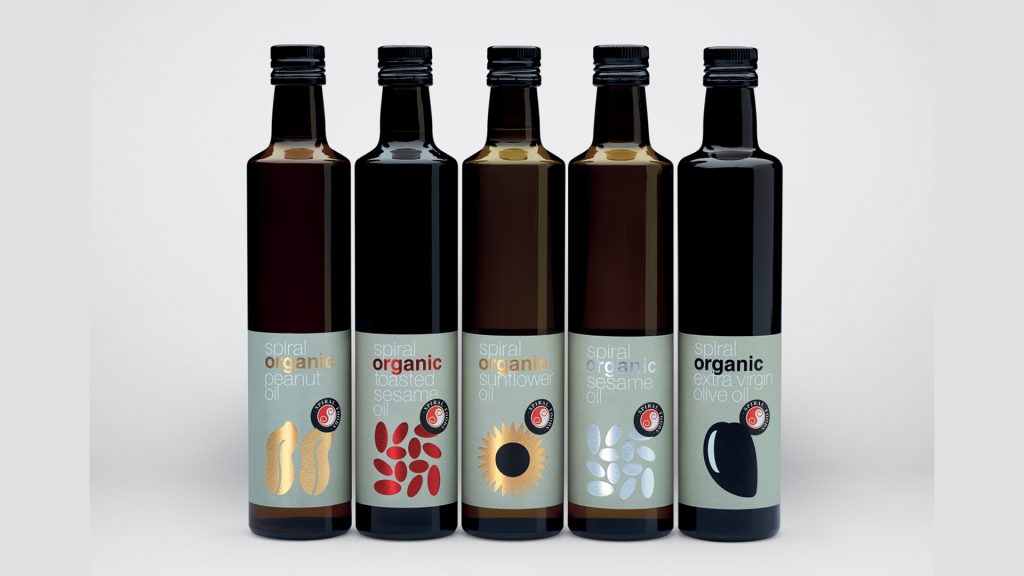
04. Spiral Foods packaging, c. 2017 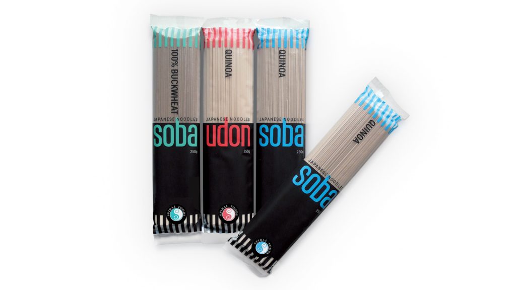
Design for Arts – Lynda Warner
 Lynda Warner has a long association producing design work in the arts sector. This folded brochure, produced in 2011, for Australian Galleries catalogues the work of renowned Tasmanian printmaker, Raymond Arnold. The brochure itself features an unusual angled cut adding sense of the unexpected to the piece.
Books & Publications – Lynda Warner
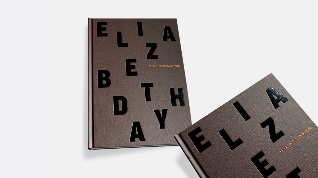 Lynda designed this art-book in 2017; Discontinued Narratives, A collection of works by Australian crossdisciplinary visual artist—writer, Elizabeth Day.
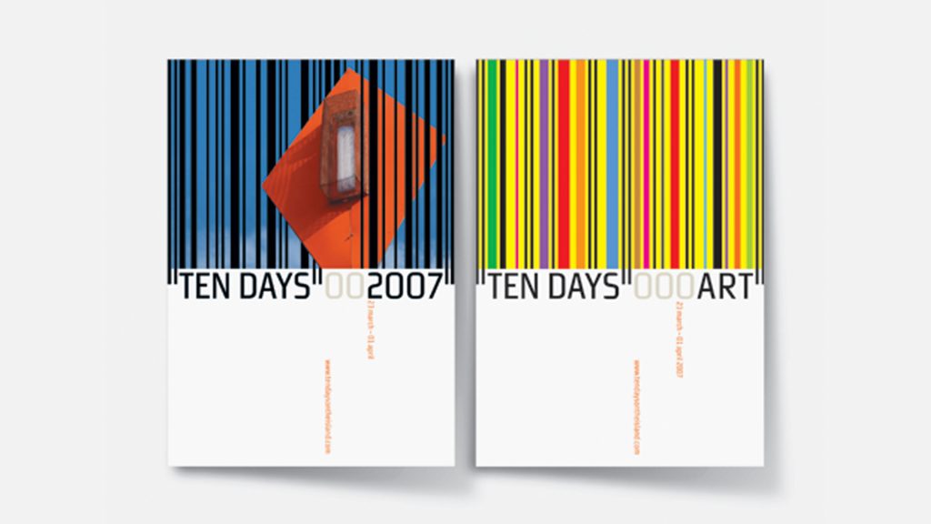 Also, on the theme of arts are these programmes from the 2007 Arts Festival; 10 Days on the Island—a statewide event which showcases local art and creativity.
GSM would like to thank the Australian Graphic Design Association (AGDA) for their assistance in collating this material. To the best available knowledge, all projects shown were designed by Lynda Warner unless indicated otherwise. All projects shown are protected by © Copyright of their respective owners. The shared creative input of others, including designers, illustrators, photographers, writers and clients- is acknowledged. While every endeavour has been made to supply accurate information, errors and omissions may occur. This article has been edited from a previously published story in 2019 by Dominic Hofstede, (AGDA).