In this instalment of Inspiration, GSM moves closer to home. We take a look at Kiwi Graphic Designer, Fraser Gardyne.
In Aotearoa New Zealand, few designers in any discipline become household names. The late John Britten (Products) and British migrant David Trubridge (Lighting) represent a select few who have achieved this level of recognition. But that is not to say that our nation has not produced our own crop of home-grown design heroes and heroines. As is our national psyche—they chip away quietly in the background. Fraser Gardyne may not be a household name but most experienced graphic designers in New Zealand will have heard of Designworks. For whom Fraser worked for many years before establishing his own studio.
In 2011, Fraser Gardyne was awarded the prestigious Black Pin (DINZ) for his contribution to the New Zealand design profession. A recognition placing him in the same league as fellow Black Pin recipients, John Britten (1995) and David Trubridge (2007). Unsurprisingly, when we approached Fraser Gardyne to contribute to GSM, in true kiwi fashion, he modestly responded by saying that he felt his story and work wasn’t particularly remarkable and would be of little interest. We completely disagree and thus convinced him to share…
Fraser Gardyne, in his own words…
When I was an infant, my parents built an architecturally designed, modern split level home in Wilton, Wellington. It was distinctive enough that my Primary School class organised a trip to visit. I also remember my Uncle Jim, a Southland farmer, visiting us in the early sixties in his Citroen DS19. It looked like a spaceship next to our Austin. My mother’s cousin was the painter and printmaker John Drawbridge, married to sculptor, Tanya Ashken. I loved visiting their home and studio on the Esplanade at Island Bay. I guess all these influences helped to open my eyes to the positive difference creativity and design brings to our lives.
From a young age, my brother Stuart and I drew houses and floor plans endlessly. We both looked destined to pursue careers in architecture. However, under the tutorage of Philip Markham—an excellent art teacher at Wellington College—I was encouraged to apply for Wellington Polytechnic School of Design. This study allowed me to carry on developing my creative skills, with photography becoming a particular interest. Meanwhile, my brother did go on to become an awarded architect.
Starting Out
Upon graduating, I started my first job in January 1977 as a designer for AH & AW Reed— New Zealand’s largest book publisher at the time. Publishing never paid well compared to my friends working in advertising agencies. Increasingly freelance design work supplemented my income.
In 1983, this work eventually led Grant Alexander and Ray Labone offering me a job at their design studio, Publication Graphics. I was to become the ‘first man’ on the ground in their new Auckland office. Three months later in January 1984, I moved north in my beautiful Citroen company car. In 1985, the company changed its name to Designworks to better represent it’s brand message and growing reputation working with New Zealand’s leading companies.
Industry Involvement
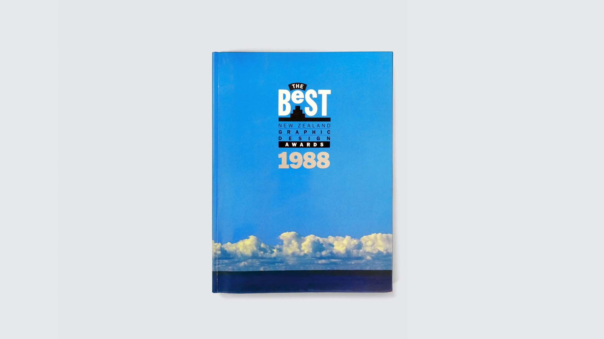
In 1987, Peter Haythornthwaite invited me onto the steering committee that set up the first Best Design Awards. Leading typesetting firm, Artspec, sponsored the event. Through Peter’s connections we were able to add several renowned international judges and speakers to the event. These included Michael Vanderbyl from San Francisco, Henry Steiner from Hong Kong and Garry Emery from Melbourne. It was an excellent start for The Best Awards. The winning work was celebrated in the inaugural Best Awards annual. I designed the annual around the concept of ‘New Zealand, land of the long white cloud’ using one of my photographs taken at Muriwai.
The mid-1980s represented a key period of change in Graphic Design. The first Apple Macintosh computers began appearing in studios. Designworks purchased their first mac in 1989. Within a few years, this new technology had completely revolutionised the industry. A decade later, in the late 90s, the next revolution arrived in the form of the internet. Every company now required websites. This constant change is one of the many things I enjoy about being a designer. Every client brief is different, as is how we address these challenges to stay relevant and be effective.
Fraser Gardyne’s Change in Direction
In 1993, I resigned my Directorship at Designworks Auckland to launch Gardyne Design. This decision was difficult but amicable. I was able to retain many of my clients who weren’t the perfect fit for Designworks. My ambition was to build a studio with a maximum of six staff. This meant we could still complete sizable projects without the pressure of time consuming administration and overheads. Some of my early clients included Diagnostic Lab, Firestone Direct, PaintPlus, Whitecliffe College and deBeer Marketing, with whom we collaborated on a number of ‘destination’ branding projects around New Zealand.
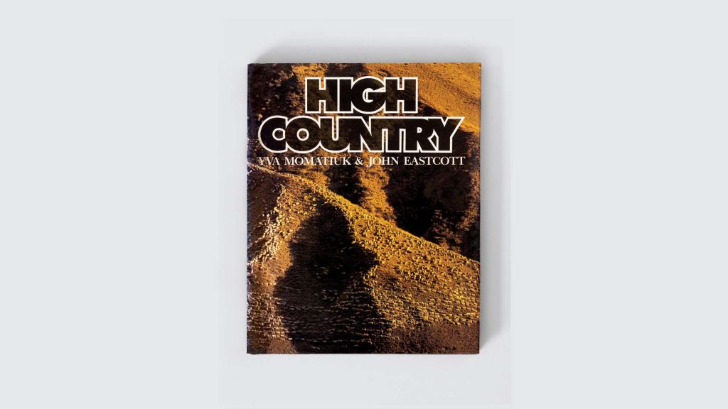
High Country 1982
In the mid-2000s, another design company approached me proposing a merger. The idea appealed as it increased our digital design capability to complement our existing creative offering. The new company—gardyneHOLT was launched in 2006 and grew to a team of 18. Our largest client was Auckland Transport, followed by multiple education and wine industry clients.
A Word on Collaboration
I have always enjoyed and valued collaboration with other designers and professionals, both on staff and across the industry. Hence my involvement in various industry organisations and events. These include The Illustrators and Designers Association (IDA) (est. 1984), The Designers Secretariate (est. 1988), The Designers Institute of New Zealand (DINZ) (est. 1991), and The Pride In Print Awards (est. 1993). For me, involvement inspires and fosters friendships that help keep my career fresh and relevant.
Continual Evolvement of Gardyne’s Career
Last year, I went through significant change once again, merging with another digital agency and rebranding as Great North. This merger brings together the energy of young digital experts with the knowledge and perspective of good design.
In reflection, the landscape and realities have changed dramatically for our industry —even in just the last five years—and I am sure things will continue to evolve. While we all must keep our focus on what’s coming next, it’s often also worth looking back. After forty-five years, I’m happy to say—I still enjoy coming into the office in the morning and collaborating with great colleagues and clients.
1970-80s Graphic Design
Graphic design during the 70s and early-mid 80s employed a mix of technologies that have now been largely superseded. Hot metal type, letterpress printing, phototypesetting, Letraset, and even typewriters (such as the famous IBM ‘golf ball’ typewriter).
In those days, I would create highly detailed full colour visuals of my designs using rapidograph and squeaker felt pens to ‘sell’ my ideas to the editorial and sales team. Creating finished artwork required specifying the fonts, point sizes and line spacing for all body text. This was because a typesetter (a person who sets type) would produce it all manually . This process could take anywhere up to two weeks to turn around. Headline and cover type was often created using Letraset, a form of rub down transfer type. Making type larger or smaller required the use of a Polaroid camera, later replaced by a Bromide camera. The resulting type was stuck to a physical card artboard with either Bull gum or hot wax. The type was then positioned and images re-sized for the lithographers to add in. After that, a transparent overlay was added with instructions such as the CMYK breakdowns for all the colours. This was then sent off to the pre-press house to compose ready for printing. Today of course, Macs have replaced many of the people involved in this process and the designer has a much more accurate idea of what the final end output will look like.
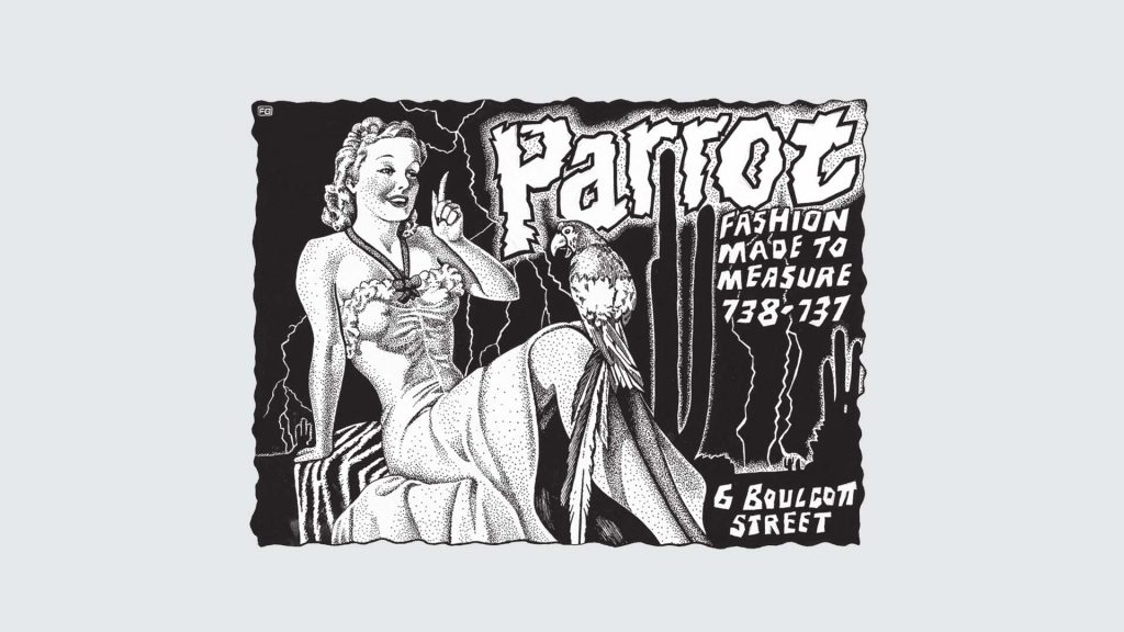
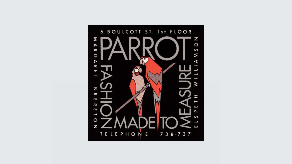
Parrot Fashion Business Card
One of my first print jobs from this era was the business card I designed for Parrot Fashion in 1978. With multiple screened colours I was relieved when the finished cards turned out exactly as I had intended.
Fraser Gardynes’ Achievements & Awards
> Steering committee member & judge of the Pride in Print Awards since inception in 1994
> Appointed to the Pride In Print Awards Roll of Honour in 2011
> Convener of Graphics for the Best Design Awards from 2003—2012
> President of the Designers Institute of New Zealand (DINZ) 2004—2005
> Recipient of the Black Pin for contribution to the New Zealand design profession from the Designers Institute of New Zealand (DINZ) (awarded 2011)
Examples of Fraser Gardyne’s Work:
BANK OF NEW ZEALAND
In 2008, the Bank of New Zealand underwent a dramatic brand makeover. They replaced the traditional coat of arms with a deceptively simple script approach, which, to some viewers, referenced the ‘piggy’ employed in the advertising campaign running at the time. Senior management, within the BNZ, felt this execution shifted too far from its core strength as the leading bank for New Zealand business. In 2009, they engaged us to re-align the visual brand values lost. We made careful changes to avoid undoing the positive gains or drawing attention to such an early revision. We brought back the Southern Cross and also redrafted the script to lose the piggy tail references which had unkindly been referred to as ‘toothpaste’ type. BNZ introduced the revised brand in 2010 with a minimum of fuss or market comment.

FLOUR POWER & FMCG PACKAGING
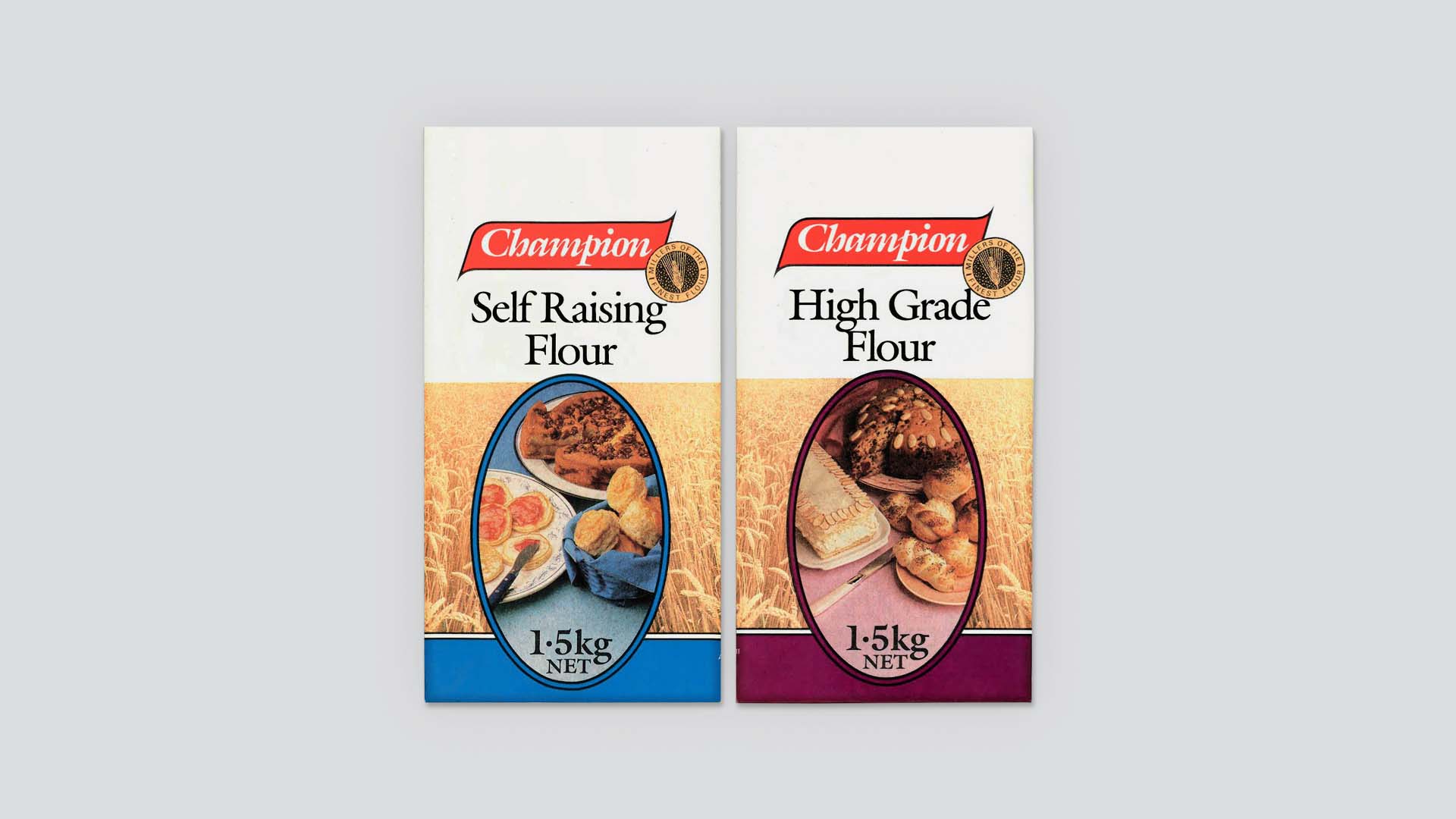
An opportunity I enjoyed and which led on to multiple projects, was the updating of the Champion flour bags in 1986. In looking at the original bags I realised that they used four colours. Although the packaging printer had never used CMYK printing for photographic images before. There was no reason that they couldn’t print CMYK. So, with a bit of negotiation, I was able to base my redesign around photos showing the kinds of products each flour suited. With the success of this project my focus shifted largely to packaging for Fast-Moving Consumer Goods (FMCG). I created designs for clients like Goodman Fielder, Nestle, Mainland Cheese and Foodtown.
ONEHUNGA BRAND
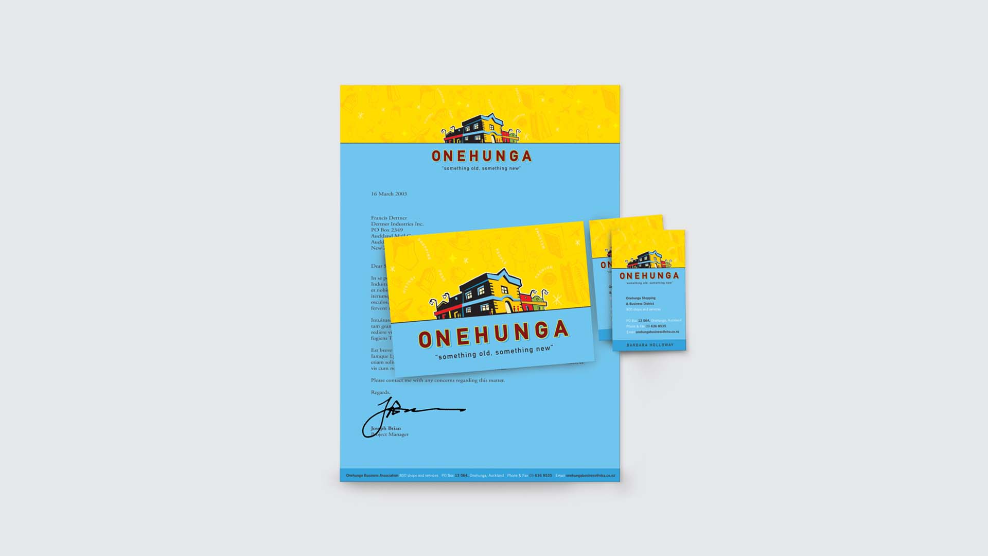
Central Onehunga businesses had suffered a dramatic fall in patronage following the turning of a section of the main street into a pedestrian mall and the opening of the large Dress-Smart shopping centre adjacent to the town centre. In 2000, the Onehunga Business Association engaged us to create a brand to help communicate the reopening of the main street and try to attract traffic, customers and businesses back to the town centre. We based our brand aesthetic around a public ceramic sculpture sited in the town centre. We then created a positioning statement of ‘something old, something new’ to attract visitors to enjoy both the traditional experience of the Onehunga township alongside the modern shopping centre close by. The brand signalled the changes and encouraged people back to Onehunga main street as a destination. Very soon previously empty buildings became fully tenanted again – proof of it’s success.
RANGITIKEI BRAND
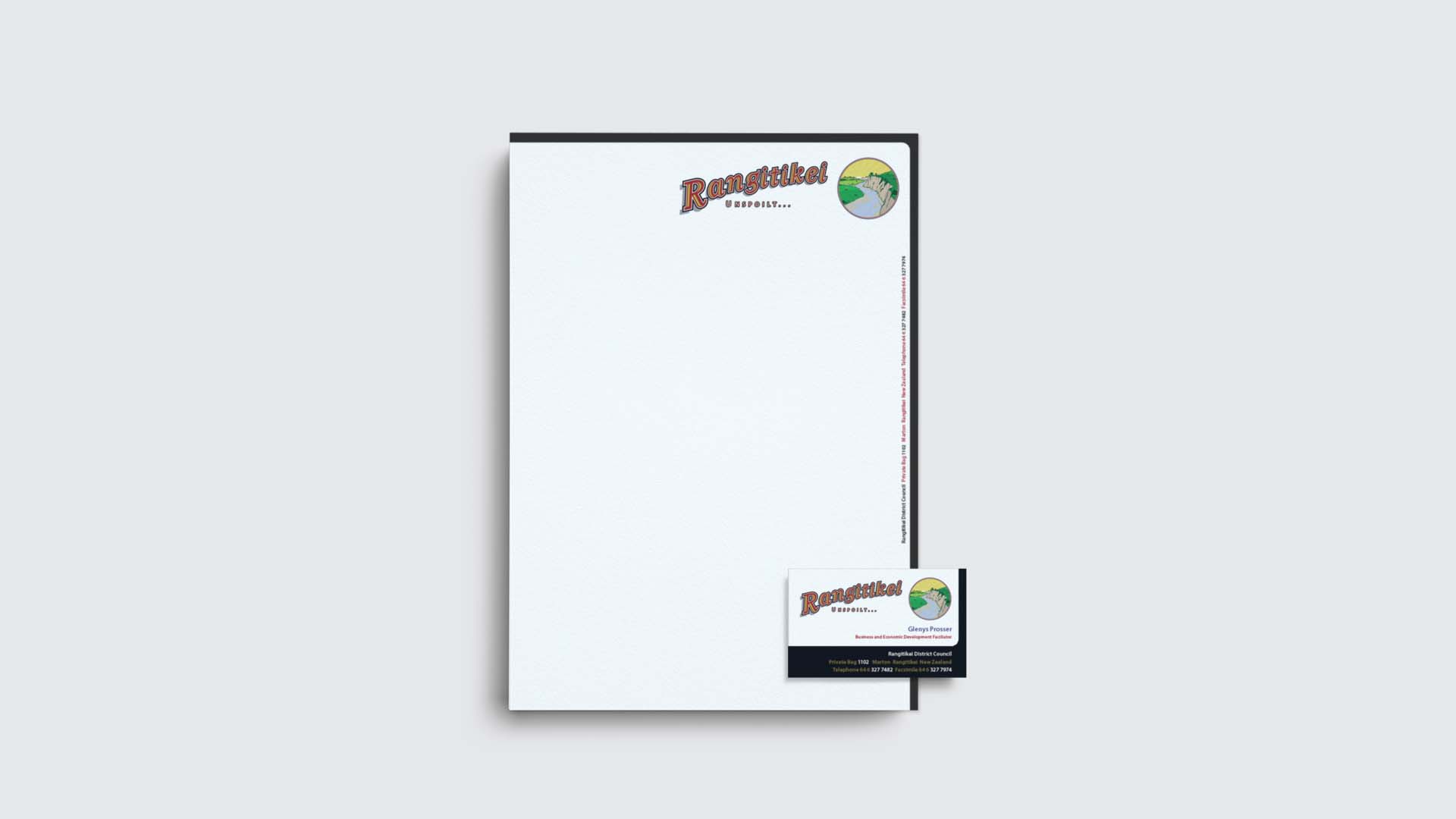
Starting in 1993, we developed a fruitful working relationship with Jillian de Beer to develop multiple destination brands around New Zealand. In 1998, she commissioned us to create a business development brand for Rangitikei in the central North Island. This was to assist with the promotion of the district and its local attractions. From research we were able to focus down on the qualities of the area which retained many of the geographic and personal characteristics that the land and its farming settlers displayed. We chose to illustrate the recognisable Rangitikei River gorge which runs parallel to State Highway 1 and the North to South rail line. The illustration and typographic style referenced back to travel posters and graphics from earlier in the century. We supported this with the ‘Unspoilt…’ positioning statement. The brand and campaign won the International Association of Business Communicators Gold Quill Award in 1999.
PAINT PLUS
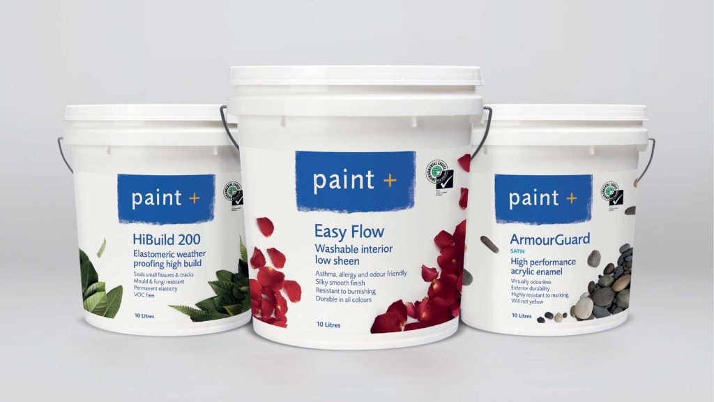
Twenty five years ago I helped clients establish a new company to manufacture and supply technically superior paint directly to professional painters. We chose the Paint Plus name to signal the products and service offered more. The business model meant Paint Plus never had to market to the general public. This saved them considerable investment. However, research conducted a decade after launch revealed that painters, whilst loving the products, were conscious their clients didn’t recognise the brand. The clients perceived the simple pail graphics as a lesser product to recognised brands. To help counter this perception we made use of the recent advantages created by digital label printing technology. These included shorter print runs at affordable prices. We highlighted the brands’ market leading eco credentials, all products being Environmental Choice certified, using photographic reference to selected environmental elements. This differentiated their product range and appealed to the painters’ customers.
WHITECLIFFE COLLEGE
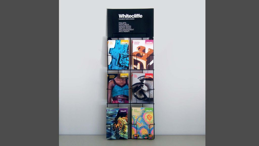
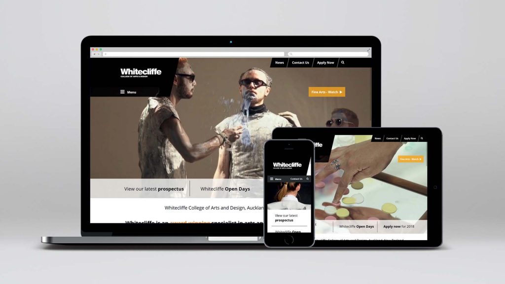
One client whom I particularly enjoyed working with was Whitecliffe College. Before they engaged Gardyne Design they had relied on their own students to produce their promotional materials. At first glance this would seem to be a good opportunity for the students to get some real industry experience. My argument, however, was that a College offering creative degrees needed to consistently reflect the highest creative standards. Whether it be with their brand, prospectus, advertising and/or website. Later our client shared the very positive feedback they regularly received when travelling overseas. Other Universities were envious of the impact of Whitecliffe’s collateral. They felt proud as we did ourselves.
