Gumboots, vine roots, and a sense of the earth – just the right mix for branding these wines…
Feet on the Ground Wines
 Feet On The Ground wines are the creation of winemaker Paige McArdle in McLaren Vale, Australia. The wines sing of the land where the grapes grow—well-managed sustainable vineyards in the popular Murray Darling wine region. Not only delicious, but as a notable point of difference, Feet On The Ground wines also come with vegan credentials! Importantly, as the product is sold exclusively by specialist online retailer Naked Wines, Paige wanted a label design that communicated both the brand values, and attracted the attention of fast-scrolling shoppers.
The Design
Cornershop Design, based in Adelaide, developed the brand strategy and subsequent label design. Cornershop Creative Director Damian Hamilton explains,
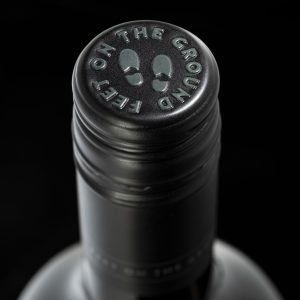
‘…the design features an image of a pair of gumboots (which is the winemaker herself), standing atop a series of vine roots—a visual metaphor for her creative ideas. The vine roots idea also implies the idea of Terroir (the combination of environmental factors that give the wine its unique character).’
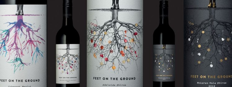
Three Wines, Three Labels
A way of differentiating each price-point tier, and reinforcing the value-proposition of each, was a critical consideration in the design. As the brand offers three different price points, a solution for clearly differentiating each tier, plus each variety, was required in the labelling design.
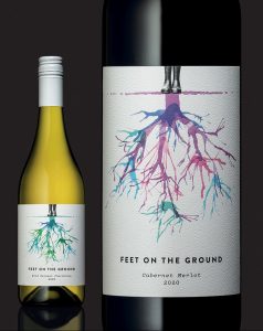 For the entry level products, the artist created vine root illustrations by blowing paint across art paper. For this tier, the colour palette within the illustration changes to distinguish the different wine varieties. A fun, colourful solution befitting the price point.
However, the team took a different approach for the middle and top-tier products by using a monochromatic vine root illustration, drawn by South Australian artist Harry Slaghekke.
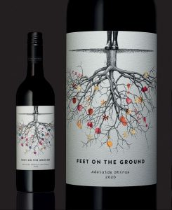 While the mid-tier labels feature this illustration punctuated by colour accents embellished with a high build varnish, and the sparing use of gold foil. They have printed on a white label stock.
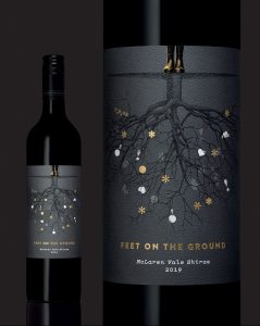 In contrast, for the top tier label, the label base changes from white to black. This is an established convention within alcohol to represent quality. In addition to this, the creative deliberately understated the design by using gold foiling. Again, to tell the story that this is a premium product.
The Label
Together, the creative & client selected Ball & Doggett Wausau Bright White Felt for all three tiers. As Damian explains,
‘Bright White Felt has a nice toothy texture and thickness. I like it for its print-ability and cost-effectiveness compared to competitor products.’
The Print
James Print, based in Mildura, was selected by the client to produce the labels. While there were no specific budgetary constraints, the team at Cornershop was mindful of delivering a finished label that reflected each tier’s quality and price point. Randall Stephens, label production manager at James Print, explains the printing process,
‘The labels were offset printed in CMYK. The gold was stamp-foiled, and the high-build was screen printed. These embellishments add both texture and an element of quality to the overall print. As on any print project, colour matching and registration between printed and embellished elements are very important. The printer must keep a keen eye over the entire run and make subtle adjustments where necessary. What made our job easier was a clear brief around expectations, and well-supplied artwork files. For this project, Cornershop over-delivered in each aspect, giving us a good framework to work with and making the job run smoothly.’
The project’s success owes much to the client, the creative team and the printer working in good collaboration. As Aaron James, Managing Director of James Print, explains,
‘The feedback from the client was very positive—which means everything to us. Seeing happy clients is a job well done for us’.
GSM would like to thank Damian Hamilton @Cornershop__design, Randall Stephens & Aaron James @James Print, and Feet On The Ground wines for their contribution to this article.
For more information on Wausau Bright White Felt stock—go to:
Australian readers: //ballanddoggett.com.au
NZ readers: //bjball.co.nz