Print & Paper

Coloured Text – How to get it Right…

coloured print

Using coloured text in printed magazines and documents is certainly more vibrant than stock standard black text on white stock. However, it can present some potential challenges at the printing stage. In this article, GSM looks at using coloured body text in print documents and how to avoid potential pitfalls... The use of coloured text is quite likely a knock-on influence from its popularity in digital design. Using colour when designing for screens is easy, as what you see is what you get. But, in the world of offset print, the print process itself adds technical challenges that the designer...

Continue Reading →

How to Use Pantone Spot Colours in Print…

The unexpected combination of design, colour & print finish, and choice of paper for the front cover of GSM10 created a result with a difference. Sometimes a little experimentation can create surprising results... For the cover of GSM10 we used a textured uncoated paper, BJ Ball Advocate Linen, on which we printed two spot colours - Pantone 876 (Metallic Bronze) and Pantone 804 (Neon Orange). Combining fluoros and metallics on an uncoated paper is usually a big "No No" but pushing the boundaries can create something special.. Replicating the Cover of GSM10 Advocate Linen is an uncoated textured paper from...

Continue Reading →

Print requiring an eye for detail – Take a Look…

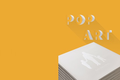
Let's Take A Walk cover

Some print jobs are far from straight forward. This children's pop-up book, ‘Let’s Take A Walk’, was one of those jobs. The extra effort won them Supreme Runner-Up in the 2017 Pride in Print Awards. The judging panel described it as ‘…an excellent job with lots of tricky finishing requiring an eye for detail…’. GSM takes a look… The Concept This particular print job initially began life as a menu revamp conceived by Sam Crofskey, owner of Christchurch café C1 Espresso. The concept of the menu was to use illustrations by Hannah Beehre, of local buildings pre- and post- the...

Continue Reading →

Offset Printing – What happens to your Artwork File?

Offset printing

Offset printing is more than a touch of a button. It takes skilled trades people, with years of experience, to transform an artwork file into a finished printed job. GSM takes a tour of Spectrum Print, in Christchurch, to see how it is done... So, what actually happens when you send an artwork file to an offset print house? We sent designer and photographer, Marty Anderson, along to Spectrum Print in Christchurch to find out. Marty shadowed a number of projects going through the printery so we could see the various stages of offset printing. The first thing that can...

Continue Reading →

BJ Ball Swatch Books – Paper Glorious Paper!

paper selector

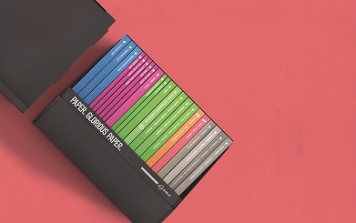
Recently, BJ Ball launched brand new swatch books to replace the older fan-apart system. No simple task when you need to accommodate and showcase more than 360 individual paper stock/weight combinations. In GSM14, we talk to Alf Walker, Creative Director at Zoo Creative, about the unique challenges and nuances of this complex project. The team at Zoo produced the original fan-apart swatches for BJ Ball back in 2014. It was an enormous project in itself, but we always felt there was room for improvement. Having the opportunity to design the BJ Ball swatch books a second time was very exciting....

Continue Reading →

How to Create Off-the-Shelf Impact with your Label

Wausau Self Adhesive Labelling

Self adhesive labels are often used in the beverage market - a highly competitive environment. To make your product stand out on the shelf, BJ Ball have recently introduced Wausau's innovative self adhesive labels. GSM15 takes a look... Recently, BJ Ball announced the sole distributorship of Wausau self-adhesive labels in New Zealand. This follows on from Ball & Doggetts, who have carried this range for a number of years in Australia. These new products, manufactured in the USA by Wausau Coated, open a whole new world of creative possibilities when it comes to ‘off-the-shelf’ impact. Based on Wausau’s long history...

Continue Reading →

Digital Print Embellishments – Look what you can create…

GSM13

Digital print technology has evolved rapidly over the last five years. To the point that you can now create embellishment effects that, previously, could only be produced with offset or letterpress. This opens a whole new world of possibilities for designers when working on short-run print projects. In GSM13, we took a look at some of the latest finishes and print effects that can be achieved using digital print systems. Specialty Toners & Varnishes Some digital print systems have the capacity to use toners beyond standard CMYK. Depending on the system, these can include other supplementary colours such as white...

Continue Reading →

Print Embellishments – Find out the Difference between Embossing, Debossing & Foiling

Print Embellishments

Colour is not the only option to drawing the reader's attention. Embossing, Debossing & Foiling are three of the more commonly used print embellishments used in conjunction with, or instead of, ink. GSM takes a look at them... Embossing & Debossing. Embossing & debossing are fundamentally the same process.  A die-block is stamped onto a sheet of paper/board to create either a raised (embossed) or recessed (debossed) impression. Typically, the height or depth of the impression is between 0.15—0.5 of a millimetre (15—50uM). Die-blocks can be made in either stepped depths; single- or multi-level blocks, or as continuous 3-D forms....

Continue Reading →

Your Business Card – How well does it represent you?

Business card

First impressions count - research shows that within the first few seconds of meeting, decisions will be made on who you are! Appearance affects how professional, trustworthy and powerful a person thinks you are. And it's not just how you present yourself - Think of your business card as an extension of you. In GSM we take a look at your business card. Interestingly,  you don't have to take out a small mortgage to create a good impression. Take, for example, the BJ Ball range of business cards. They range from the ordinary to the sublime! The role of a...

Continue Reading →

Paper, Pixels & The Brain – Onscreen Text vs Printed Text

Onscreen Text vs Printed Text

Compared with printed text, it appears that reading onscreen text may drain more of our mental resources and make it a little harder to remember what we have read. Here at GSM we do a lot of reading, so we thought it would be interesting to check this theory out... Research indicates that modern screens and e-readers fail to adequately recreate certain tactile experiences of reading on paper. They also prevent people from navigating long texts in an intuitive and satisfying way. This, in turn, affects reading comprehension. There are two reasons for this. one based on the physiological aspects...

Continue Reading →