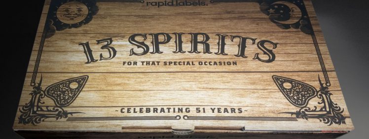
GSM Blog - read more about print on paper.

The BJ Ball Student Design Contest – From Brief to Print

Student Design Contest

The BJ BALL Student Design Contest is back - and better than ever! Designing for print is an essential skill for graphic designers in the commercial world. For design students, however, the complexities and costs involved mean that gaining real world experience is often prohibitive. Cue BJ Ball, who last year resurrected their Calendar Design Competition. For those of you too young to know, this was a staple event within the extended Vis Com curriculum many years ago. Their aim was to give design students an opportunity to have their creations brought to life using real world print. From Brief...

Continue Reading →

Stefan Sagmeister – Design with no Boundaries

Stefan Sagmeister

Award winning designer, Stefan Sagmeister, is one of the most imaginative and original creative thinkers around today. Known particularly for his type and handwriting-inspired designs, Sagmeister has created some of the boldest, most innovative, engaging work around. None more so than his use of the human body as a canvas. He makes type come alive, literally! His Background Sagmeister was born in Austria but now lives and works in New York. He began his career path studying graphic design at the University of Applied Arts, Vienna. From there, he received a scholarship to study at the Pratt Institute in New...

Continue Reading →

Understanding Onscreen Colour vs Printed Colour

Working with printed colour requires not only creative flair, but also some technical knowledge about how colour is produced in print. In this article GSM takes a look at getting the most from CMYK colour. In the world of offset print, CMYK stands for Cyan, Magenta, Yellow and Key (black). It is also known as process colour. What is important to understand with offset print is the difference between onscreen colour and printed colour. There is nothing worse than seeing that the colours of a freshly printed piece don’t look anything like they did on-screen. This is not the fault...

Continue Reading →

Erik Marinovich – Lettering Artist

Eric Marinovich

In this issue of GSM INSPIRATION we take a look at the work of San Francisco based lettering artist and designer Erik Marinovich. Erik Marinovich has drawn letters, type and logos for the likes of Nike, Target, Google, Hilton, Facebook, Sonos, Sharpie, The Criterion Collection, Air Canada, Gap, Ford Motor Company..., to name just a few. His passion is type and is a co-founder of Friends of Type. Erik is also co-founder of Title Case, a creative work space that conducts workshops and lectures. Between client work, teaching and side-projects, you’ll find him on the road promoting Keep Fresh Stay Rad and Let’s Go Letter Hunting....

Continue Reading →

Pro Bono Design for Charity – to do or not to do?…

Pro bono

In GSM10 we caught up with Mandy Nelson from G&A Creative Agency to discuss the Pros and Cons of Pro Bono work for charity. Our question - Does providing free design to non-profits devalue design services, or add value to a good cause? I often ask myself if working for nix is worth it. The only possible answer is a definite ‘maybe’! It depends on your viewpoint - I want to unbundle that question. Pro Bono Work for a Charity I am settlor of the Full Colour Trust as well as joint owner of G&A Creative Agency (G&A), provider of design...

Continue Reading →

Coloured Text – How to get it Right…

coloured print

Using coloured text in printed magazines and documents is certainly more vibrant than stock standard black text on white stock. However, it can present some potential challenges at the printing stage. In this article, GSM looks at using coloured body text in print documents and how to avoid potential pitfalls... The use of coloured text is quite likely a knock-on influence from its popularity in digital design. Using colour when designing for screens is easy, as what you see is what you get. But, in the world of offset print, the print process itself adds technical challenges that the designer...

Continue Reading →

Large Format Print – How Big is too Big?

Large format print is a specialist area within the print industry which can cause inexperienced designers more than just a few headaches. The term 'large format print' (also called 'outdoor' in the advertising media world), is used to refer to types of printed material that is output at very large sizes. Think billboards, tradeshow displays, bus-back advertising and printed mural or building signage. A lot of this material is digital printed on substrates such as synthetic paper, adhesive paper, canvas, fabric and aluminium composite board (ACM). When it comes to designing for large format print—creativity aside— understanding some of the...

Continue Reading →

Marian Bantjes – Eclectic Graphic Brilliance

Marian Bantjes

A studio on a small island off the west coast of Canada seems like an unusual place to find an internationally renowned designer, typographer, published writer, illustrator and mixed media superstar. But this is exactly where you'll find Marian Bantjes. This is where she crafts her own brand of eclectic graphic brilliance. GSM takes a look into the unorthodox world of Marian Bantjes… It's almost an understatement to say that the work of Marian Bantjes crosses many boundaries. Known for her detailed and precise vector art and her obsessive hand work, Marian has a love of patterns, ornamentation and fluid...

Continue Reading →

How to Use Pantone Spot Colours in Print…

The unexpected combination of design, colour & print finish, and choice of paper for the front cover of GSM10 created a result with a difference. Sometimes a little experimentation can create surprising results... For the cover of GSM10 we used a textured uncoated paper, BJ Ball Advocate Linen, on which we printed two spot colours - Pantone 876 (Metallic Bronze) and Pantone 804 (Neon Orange). Combining fluoros and metallics on an uncoated paper is usually a big "No No" but pushing the boundaries can create something special.. Replicating the Cover of GSM10 Advocate Linen is an uncoated textured paper from...

Continue Reading →

Print requiring an eye for detail – Take a Look…

Let's Take A Walk cover

Some print jobs are far from straight forward. This children's pop-up book, ‘Let’s Take A Walk’, was one of those jobs. The extra effort won them Supreme Runner-Up in the 2017 Pride in Print Awards. The judging panel described it as ‘…an excellent job with lots of tricky finishing requiring an eye for detail…’. GSM takes a look… The Concept This particular print job initially began life as a menu revamp conceived by Sam Crofskey, owner of Christchurch café C1 Espresso. The concept of the menu was to use illustrations by Hannah Beehre, of local buildings pre- and post- the...

Continue Reading →