MATE ACT NOW is a co-ordinated response of over 150 designers from some of the world’s top creative studios. It's initial aim was to drive climate change in response to the 2019/20 Australian bushfires. However, the global outbreak of Covid-19 recontextualised it to something bigger! GSM talks with Chris Flack, from Strategy Design, Christchurch, about the reasons why he initiated “Mate ACT NOW”, how it all came together and what the response has been… Chris, you’re obviously passionate about saving the environment but why did you decide a poster campaign could help? [caption id="attachment_4679" align="alignleft" width="300"] Chris Flack[/caption] We had...
Plastic waste is a severe problem around the world. As we strive to move to a Circular Economy innovative companies search to replace plastic with environmentally friendly packaging. Here's an example... One of the major offenders is the plastic six pack ring. We've all seen images of turtles or birds ensnared in them. But it's not just the visible suffering of the animals which is of concern. The hidden danger is what happens to the plastic as it breaks down. More than 8 million tonnes of plastic end up in the ocean every year. As it breaks down, research suggests...
American graphic designer, Ed Fella has been referred to as the ‘Graphic Godfather’ and ‘the contemporary master of hand-drawn typography’. A number of world-leading institutions hold his work, including the Cooper Hewitt Smithsonian Design Museum (NYC) and the Museum of Modern Art (NYC). Ed Fella is also a recipient of the Chrysler Award (1997) and the American Institute of Graphic Arts (AIGA) Medal (2007). GSM14 takes a look at the work of Ed Fella… The Early Years Ed graduated from technical school in Detroit in 1957. He studied typography, pasteup and illustration. For the next 30 years he worked in...
Here at GSM magazine, we like to research innovative ideas for the use of paper and printing. We call it The Big Idea. In GSM12 we see how a daily newspaper in Sri Lanka used ink to combat Dengue Fever. According to the World Health Organisation, dengue fever is one of the most rapidly spreading diseases on the planet. This mosquito-borne virus causes a severe flu-like illness. In some cases it can be fatal. In 2014, Sri Lanka experienced an epidemic of the disease. This prompted the government to initiate National Dengue Week. Printing for the Social Good Mawbima is...
Risograph printing is basically an early form of digital printing. Let's take a look at what it is and how to design for this printing method... Japan launched the Risograph in the 1980s as a low cost means to create colour reproductions for short to medium volumes. The technology and process have inherent quirks, including slight misregistration and uneven ink coverage. This means every reproduction is in some way unique. Risograph Printing is not based on the CMYK colour model. Instead it uses its own distinctly vibrant colour system. Unlike laser printing, risograph uses wet ink, not dry toner. The...
Colour is one of our most powerful weapons in attracting attention. With so much material produced in CMYK the use of spot colour can be a particularly effective way to achieve better audience cut-through. Let’s take a closer look at what spot is - how it is fundamentally different to CMYK and how we can get the most from using these 'specials'. CMYK versus Spot Colour The fundamental difference between CMYK colour and spot colour is that CMYK uses overlaid ‘process’ inks (Cyan, Magenta, Yellow and Key—aka Black) to create a colour range (the CMYK gamut). By comparison, spot colour...
Let's take a look at the main binding methods used in commercial printing - How they differ and what we need to know about them to get the best results... With printing complete the job needs to be bound - that's the collating, folding and trimming of the printed sheets. There are a number of binding methods available but to decide which one is suitable for your commercial print job it's important to consider the following: the size of the document the intended use and lifespan the type of content the client’s budget It's equally important to discuss binding options...
What is a Circular Economy? We take a look at the Concept and how Paper fits in... The concept of a circular economy was actually developed back in the 60's. Kenneth Boulding, an american economist and peace activist, wrote "The Economics of the Coming Spaceship Earth". It outlined the core principles of what we now know as the Circular Economy. A Circular Economy is ‘an economic system aimed at eliminating waste and the continual demand for new resources’. In many ways, the natural world is the perfect example of a circular economy. Plants grow from the earth. Animals eat the plants....
Living in a Circular Economy means we consider each product we use in terms of its sustainability. So, when it comes to printing, we need to look at the sustainability of the paper we print on. The best way to do this is to learn about the environmental credentials of paper. Environmental credentials relate to the source of raw materials, manufacturing processes, sustainability and / or potential impact of a product relative to the environment. Environmental Certifications and / or Credentials fall into one of the following three levels: Forest Level Certifications Mill Level Certifications & Credentials Paper Level Certifications &...
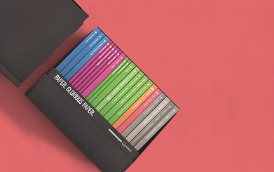
Paper is an integral part of the print job. How it looks and feels is going to have a big impact on the end result. Considering the paper stock at the very start of the job (i.e. the concept stage) means the final printed piece will tick all the boxes.
So, what are some of the things we should consider when selecting paper for a print job? Start with the bigger picture:
What message are you conveying – How does it look and feel?
What is the printed piece being used for and in what situation?
How long does it need to last in the marketplace?
How are you printing it – offset or digital print?
What paper fits within your budget?
Now, think about the finer details of choosing your paper. Here’s a checklist to help you:
UNCOATED VS COATED
Coated paper has a clay coating to add smoothness and either a Matt, Satin or Gloss finish. The clay coating acts as a barrier to stop the ink being absorbed into the paper, thus giving the image definition and making colours appear brighter – perfect for a company profile or real estate brochure.
Uncoated papers have no coating, they have a raw, organic feel and can be textured. However, uncoated paper can be susceptible to dot gain, when the ink is absorbed into the paper and spreads. This isn’t a bad thing, it just means the image appears softer, both in definition and colour – think furniture catalogue or brochure for a company with an environmental message.
SMOOTH VS TEXTURE
Smooth paper enables light to be reflected more evenly thus producing brighter colours and crisper images – for example, a fashion catalogue.
Texture adds more interest and enhances your message on a subliminal level – perfect for scenic images but not ideal for skintones – use for clothing swing tags or for the cover of a company profile.
WHITENESS
The whiteness of a paper conveys a look, as well as affecting the colours of your image:
A crisp bright white conveys professionalism and brightness of colour.
An off white/cream suggests a softer feel with a more muted/sepia look possibly conveying an environmental approach.
WEIGHT/THICKNESS
Paper is measured by weight – grammes per square metre (gsm) and board is measured by thickness – microns (Um). There are a number of reasons to consider weight/thickness:
Show through – In general, the heavier the paper weight the higher the opacity of the paper. This means less show through which is important when there is a lot of ink coverage.
Bulk – for a job with just a few pages, bulk up the look of the booklet by selecting a heavier weight e.g. 130gsm instead of 115gsm. For a multi-page booklet, which requires posting, drop the page weight to keep postage cost low.
When selecting your cover weight think outside the square, consider packaging boards that add more bulk over fine papers and can keep you within budget.
For packaging, always talk microns both for folding considerations and to hold the contents of the packaging.
PAPER SUSTAINABILITY
Paper sourced from sustainable pulp with minimal impact on the environment is essential to creating a Circular Economy. Ensure your chosen paper carries environmental credentials from either the forest level:
Finally, with paper selected, organise for a mock-up to be made to enable the client to truly visualise what their job will look and feel like. A mock up also helps you to see actual thicknesses, sizes and weights. This is important for bindery details i.e. weight of cover & style of binding, as well as postage and direct mail costs.
You can order your mock up from BJ Ball Designline.