Creating artwork for Letterpress is reasonably straight forward with a little understanding of the process. In conjunction with our article “The Art of Letterpress Printing” GSM looks at the basics…
Artwork
It is best to create Artwork using a vector based design program like Adobe Illustrator or InDesign. Avoid using Photoshop.
Colour
Letterpress is effectively a one colour per pass process. This means that for every colour, we require a new plate and print pass. Therefore, limit your range to one, two or three Pantone Spot Colours. Do not use Process / CMYK colours (and definitely do not use RGB colours). Ensure you are correctly specifying Pantone Spot Colours in your artwork files.
If you need more colours consider combining Letterpress with another process such as Offset or Digital Printing. However, it is important to talk to your Letterpress printer about this first, as the order in which they undertake the printing may be important.
Unless you are experienced with the process, avoid overprinting colours.
To create ‘lighter’ versions of your colour/s—you need to use TINTS. In Adobe Illustrator or InDesign these are created from Pantone Spot Colours using the COLOR palette.
Note that large areas of colour coverage will have a tendency to be patchy so adjust your expectations. With letterpress, imperfection is part of the charm. No two prints will be exactly the same.
Avoid using pseudo effects (such as drop shadows or outer glows) or Transparency.
 Images
The right type of images can look great using Letterpress. Vector line drawings in particular work well, providing the detail is not too fine.
You do need to set up Photoshop images as monotone using your chosen colour/s. Do keep in mind that the printer will reproduce them using a course halftone screen. The end result is very different to offset printing.
Fonts
Be aware that some fonts, particularly those with very fine strokes, may be problematic if used at small sizes. If in doubt, talk to your printer.
Supplying of Artwork
Supply your artwork to the printery as an Ai, EPS or PDF file generated from Adobe Illustrator or InDesign, with fonts converted to outlines.
The printery will then output your artwork as Spot Colour separations—so you can pre-flight your work by printing and checking the print separations.
Choice of Paper
Part of the appeal of today’s Letterpress is the debossed effect created by stamping into the paper. This means choice of stock needs to be a considered factor in your design. Richly textured, heavyweight Uncoated or Specialty stocks with soft surfaces will yield the best ‘impression’. For example, BJ Ball’s Crane’s Lettra, made from 100% pure cotton linters (a by-product of the cotton industry), is manufactured especially for Letterpress printing.
Anatomy of Letterpress Artwork
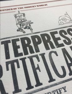
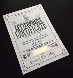
 Let’s take a look at a certificate BJ Ball produced for their Letterpress workshops held earlier this year. It was a co-lab project between two Auckland printers—Inkiana Press & Laserfoil.
The design incorporates three print methods which were laid down in the following order—Digital CMYK, Hot Stamp Foiling and Letterpress.
The BLUE artwork represents the letterpress component. BJ Ball designed it as a layout guide only. Workshop attendees re-composited it using pre-existing hot type characters and metal rules.
They then printed it in straight black on a 188 year old Albion Letterpress. Now, THAT is old-school!
Learn more about the Art of Letterpress Printing here.…
GSM would like to extend our thanks to the team at Laserfoil Design & Print (Auckland) for allowing us access to their printery and assisting with the technical information in this article.

