
A studio on a small island off the west coast of Canada seems like an unusual place to find an internationally renowned designer, typographer, published writer, illustrator and mixed media superstar. But this is exactly where you’ll find Marian Bantjes. This is where she crafts her own brand of eclectic graphic brilliance. GSM takes a look into the unorthodox world of Marian Bantjes…
It’s almost an understatement to say that the work of Marian Bantjes crosses many boundaries. Known for her detailed and precise vector art and her obsessive hand work, Marian has a love of patterns, ornamentation and fluid organic forms. However, there is also a deep underlying structure and formality to her work. It is these combinations and juxtapositions that draw the interest of such a wide variety of designers and typographers. From the experienced formalist to the young student.
Her Career
Marian’s eclectic style is the product of a varied history in graphics and fine art. Initially, she started out working as a book typesetter. Marian then co-founded and ran graphic design studio, Digitopolis. But, since 2003, she has worked on her own as a designer/artist/letterer. It is this latter work for which she has become internationally known.
Her Accolades
As well as an extensive body of work, Marian Bantjes has lectured on her work, judged at design awards and been recognised for her achievements worldwide. Here are just a few noteworthy mentions:
- As a testament to her contribution to the design world, and her influence on it, a number of Marian’s pieces can be found at the Cooper-Hewitt National Design Museum, New York.
- In 2008, Alliance Graphique Internationale (AGI) accepted her as a member.
- In 2010, Emily Carr University, Vancouver, Canada, awarded her an Honorary Doctorate of Letters.
- She has judged at a number of top design awards and spoken at the renowned TED Conference, California, 2010.
- In 2013, BookForum named “Pretty Pictures” as one of the best twenty art books in the past 20 years. “Pretty Pictures” is an extensive monograph of her work,
- Marian’s work has been published in over 100 books and magazines around the world.
Some Examples of Marian Bantje
Varoom Magazine
Since issue 14, Marian has been a regular contributor to Varoom. Her work appears as the central double page spread of each issue. Marian’s wildly varied pieces respond to the set theme of each issue. She often uses unexpected materials such as decorative tape, plasticine, and dollar store stickers.
 Print Magazine
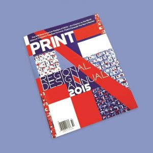
Each year, designers across the United States and the world, eagerly await the Print Magazine Regional Design Annual. For the 2015 Edition, they asked Marian to create the cover, title page, and separate opening pages for each region.
To commence, Marian started with the loose concept of maps and targets. She took a structured approach, knowing that she wanted a consistency between the section pages. At the same time these section pages needed to provide a clear break from the magazine’s content.
For the cover, she built a grid from the Print logo. And for the title and regional pages, she used a ‘target’ to create grids. Using colours taken from her mental image of each region, Marian then positioned the regional targets relative to the area’s location. The result is a bold and cohesive design with a lot of character.
 Eames Tiki Chair
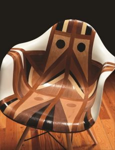
As part of a promotion for Creative Cloud, Adobe approached Marian to ‘hack’ an Eames chair.
Unfortunately, Marian responded that she wasn’t using CC yet. And if she were to do this project, she couldn’t imagine doing it digitally.
Never the less, Adobe was fine with her working by hand, and sent a film crew to record the process.
In the end, Marian created the geometric design from wood veneer, within the set 48 hour time limit, in her kitchen.
 Money Alphabet
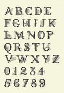
Commissioned by Fortune Magazine, Marian designed this alphabet in the style of money. She created two versions of each glyph. One ‘clean’ version, and one with spirograph detailing. This way the magazine could use them as display elements as well.