Recently, BJ Ball launched brand new swatch books to replace the older fan-apart system. No simple task when you need to accommodate and showcase more than 360 individual paper stock/weight combinations. In GSM14, we talk to Alf Walker, Creative Director at Zoo Creative, about the unique challenges and nuances of this complex project.
The team at Zoo produced the original fan-apart swatches for BJ Ball back in 2014. It was an enormous project in itself, but we always felt there was room for improvement. Having the opportunity to design the BJ Ball swatch books a second time was very exciting.
We started the new swatch books project by reviewing the existing fan-apart swatches. What worked? What didn’t work? These were some of our challenges…
Keeping the swatch books current
The team at BJ Ball had identified a fundamental problem. It was difficult to update the fan-apart swatches. The process of recalling thousands of swatches across the country, breaking these apart and removing or replacing products was simply not feasible. This resulted in the fan-apart swatches becoming obsolete reasonably quickly. So, a requirement of the new system was to develop a format that could keep up with BJ Ball’s current product range.
Prior to the fan-apart swatches, BJ Ball had an extensive book system. So, we revisited this idea. By using a book system BJ Ball could delete old products simply by removing the relevant books and add new products by producing a run of new books and delivering these to customers. This significantly extends the usable lifespan of the system, which represents a sizeable investment for BJ Ball.
Production Costs
Production budget was also a key consideration. There is no easy way to collate and bind so many products together. It was obvious early in the play that having one book for each of the 44 product families was just too costly. With assistance from BJ Ball, we went through their product range to identify where products could be grouped together. By the end of this process, we had reduced the number of books down to 22. This kept production costs low enough to make the books a viable solution.
Design Challenges
One of the early key design challenges was ‘how’ to display the paper samples. This sounds simple. The obvious solution is to pad and square trim the stocks. However, this approach requires printing different weight and stock information on each page so the user knows which sample is which. That would mean 360 individual print runs. Budget blown.
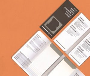
Instead, we looked at printing the stock and weight information on the inside of the swatchbook covers, not on the stocks themselves. Thus significantly reducing the amount of printing required. It did, however, create a different problem. With a straight square cut pad and no printed information on the stocks themselves, how does the user match the information to each stock? We developed a design solution using a ‘waterfall’ pad where each overlaying stock sample is cut 7mm shorter than the preceding stock. The product name and weight are printed at corresponding heights on the inside cover.
This works really well for the user but creates another production issue..

Production Challenges
Without any printed information on the stocks themselves, the team assembling the books would need extremely accurate product inventory labelling and tracking to collate the correct products in the right order. Luckily our production team at Spectrum Print was up to the task. Careful thought was also given to the knife forms for the book covers. All of the final 22 swatch books use one of two knife forms, either a single, or a double waterfall pad.
The Swatch Books Box
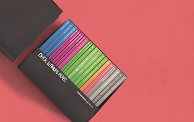
Keeping all 22 swatch books together as a set was another key design challenge. We developed a bespoke box which consisted of a base and lid. The lid flips and slips over the base to create the final display. We really wanted to develop a box solution that was self-supporting—without gluing, stapling, or a crash-lock base. We developed more than 30 prototype forms. Custom Cutting Formes in Christchurch then computer cut a number of designs from the final stock.

Applied Graphics
For the applied graphics, we wanted to keep the whole look simple and understated but also gain some real off-the-shelf pop! To achieve this, we selected a colour palette that uses combinations of metallic and neon Pantone colours. The swatch book covers were printed on BJ Ball Crescendo, a highwhite, double-sided coated board.
Finally, after more than eighteen months in development, the swatch books were complete. The end result is exactly what we set out to achieve. A design-led, yet practical solution that out-performs the previous design and provides a usable, inspiring toolset for printers and designers alike.


BJ Ball swatch book sets are available to select customers. Please contact your local BJ Ball consultant for more information.
This article was originally published in GSM14. To read this and other great articles purchase this issue here.


